|
|
|
Last update - 1635 GMT, 15th Aug 2008
|
|
|
|
|
Recently updated items
|
Updated Satellite
Temps |
Updated El-Nino/Southern Oscillation data
|
![]()
|
Time of Observation Bias
When using a pair of min/max thermometers for daily temperature
observations, the time of day at which the readings for the previous 24
hours are observed, and the thermometers are reset, will often cause a
time of observation bias (TOB). If readings are taken near the times of
daily highs, or daily lows, those highs, and lows, often affect the
readings of two days.
Visiting Warwick Hughes
Let me call your attention to a
recent addition
there.
climateaudit.org
In case you have not followed the links, Steve McIntyre has many interesting
posts at
www.climateaudit.org.
Climate Catastrophe - Cancelled
OTTAWA: On April 13 the University of Calgary, in cooperation with the
Friends of Science Society, released a video entitled: Climate
Catastrophe Cancelled: What you're not being told about the science of
climate change.
Hockey Stick Saga Developments
It seems that as more researchers examine the McIntyre and McKitrick
critique of the Mann et al "hockey stick", their critique gains
increased support. Several recent developments are described at
their websites.
A Quiet Anniversary
Have you adjusted your temperature data lately?
About Nature
A magazine named Nature is said to be a "journal of science".
CO2 Measurement Problems
When reading about extraction and analysis of atmospheric gases from
ice cores, you may notice some things that seem rather odd. One
favorite such oddity is a statement in the file
Historical carbon dioxide record from the Vostok ice core:
Hot and Cold Summers
A paper titled "European seasonal and annual temperature variability,
trends, and extremes since 1500" was published in the issue dated March
5, 2004, of the AAAS magazine named Science. It seems that the authors
concluded that the summer of 2003 was the hottest summer in Europe
since 1500.
Mauna Loa CO2 Measurements Updated
In March of this year a widely reported story about
CO2 measurements at Mauna Loa was discussed in
CO2 Report Makes the Rounds.
Since then, the data on which the report presumably was based
have been posted at
CDIAC.
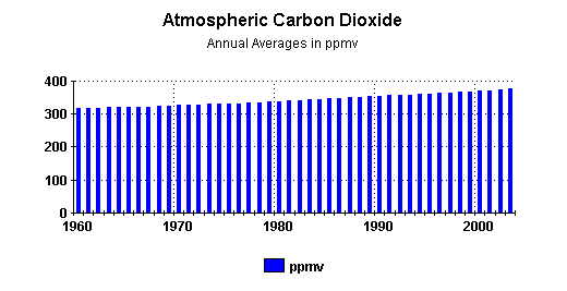
Keeping in mind that the unit of measure is ppmv (parts per million by volume), it is clear that CO2 is a very small portion of the atmosphere. Among the so called greenhouse gases, it is a very distant second to H2O. And yet, some people portray CO2 as if it had almost mythical powers of dominating climate around the globe. A glance at some other measurements may help clarify the picture somewhat. 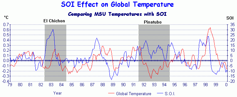
(3 month averages of lower troposphere temperature variances and inverted SOI) While the atmospheric parts per million of CO2 have continually increased during recent decades, atmospheric temperatures have risen, and fallen, uninfluenced by any notions that some people may have about the powers of CO2. Atmospheric temperatures respond to realities, not myths. As for the amount of the increase of atmospheric CO2 from 2002 to 2003, it was approximately two and one half parts per million, 2.54/1000000.00 to be more precise. Here is a graphic summary of the annual increases since 1960: 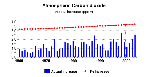
As he did in March, Miceal O'Ronain has provided, in both tabular , and graphical , forms, nice compilations of year to year differences of monthly, and annual, averages of Mauna Loa CO2 measurements.
Solar Activity and Terrestrial Climate
On July 6, 2004, a BBC article, headlined
Sunspots reaching 1000-year high, caught the attention of
a number of readers. Related articles soon appeared in other
publications, for example:
Suspot activity hits 1000-year high at Swissinfo.org,
The truth about global warming - it's the Sun that's to blame
at the London Telegraph, and
Hotter-burning sun warming the planet
at the Washington Times.
You can readily notice various differences between their Greenland and Antarctic results, as well as between either of those and GSN, particularly during the Maunder minimum. These, and some other difficulties, are briefly discussed in Usoskin et al. 2003. Of the presentation in Hamburg there is available a file of slides, Solar Activity over the last 1150 years: does it correlate with Climate?. Among those slides is the above graph, as well as several other graphs not included in Usoskin et al. 2003. Among the latter are two on a slide labelled: Comparison: Sunspot number & Climate. 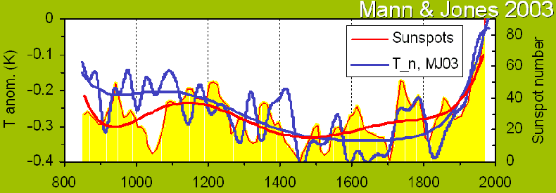
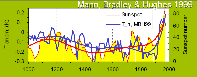
The next slide from the presentation offers 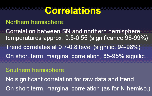
I would guess that the trend that correlates at 0.7-0.8 level is somehow related to the very smooth lines that run through each of those two graphs, including the sunspot lines that continue climbing right through the Maunder minimum. If their models cannot get more realistic about a phenomenon such as the Maunder minimum, they would seem to need much more work before asking people to take their climate correlations seriously. I suspect that one can find a variety of statistical trends that appear to correlate incidental aspects of phenomena. As displayed in the presentation, the proffered trend seems to me to be a distraction from identifying correlations based on physical causation. A subsequent slide of the presentation asserts SN runs ahead of climate by 10 years (SN presumably being their calculated sunspot numbers). I can imagine various lead times between sunspot numbers and various climatic effects, but I cannot see a 10 year lead time in either of those two graphs. (If you can, please let me know.) While Usoskin et al. 2003 and related papers, including their difficulties, seem to me to be quite interesting, it also seems to me that the attempt in the presentation to portray a correlation with either version of the hockey stick, much less with both versions, was not conducive to resolving any of the difficulties. Some incidental comments: Usoskin et al. 2003, and the presentation, emphasize the very much higher sunspot numbers in recent years than in earlier years, even within the historical series of group sunspot numbers. I estimate that the 11 year smoothed GSN of 1959 is about 57 per cent higher than that of 1790, which by my calculations was the highest before 1935. However, using Wolf sunspot numbers (WSN), the 11 year smoothed sunspot number for 1959 seems to be only about 20 per cent higher than that of 1790. Still higher, but not as strikingly so. The next two graphs present annual, and 11 year smoothed, comparisons between numbers based on each of the systems. 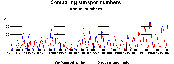
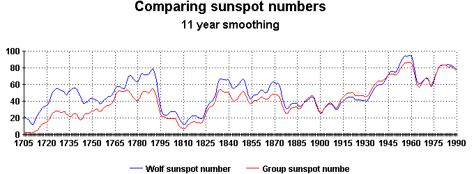
(Data for these two graphs are from: GSN and WSN ). I am not aware of the relative merits of the two numbering systems. One obvious advantage of GSN is that they extend back to 1610, while WSN extend back only to about 1700, and some might suggest only to about 1750. Update added 30 July 2004 A recent UPI article, Climate: The Vanishing Solar Factor, has been added to the mix. I will comment briefly on just a couple of parts of it. In order for the sun to force the climate to the little ice age observed during the Maunder Minimum, the change in the solar constant had to be about twice what has been observed during modern, zero-sunspot periods.1. Modern zero-sunspot periods have been very brief. The most recent calendar month with a zero WSN was June 1913; the most recent calendar year with a zero WSN was 1810. A zero sunspot day, or week, may not tell us much about what the so-called solar constant would do during a zero sunspot year, or a zero sunspot decade. 2. The statement implies an assumption that variations of solar wind and the magnetic heliosphere, and variations of the flux of cosmic rays, have no climatic effects, but without addressing research results indicating that they do. Raimund Muscheler probably could direct the author of the article to some of that research. In the 2002 Harold Jeffreys Lecture to the Royal Astronomical Society in London, Solanki said: After 1980, however, the Earth's temperature exhibits a remarkably steep rise, while the sun's irradiance displays at the most a weak secular trend. Hence the sun cannot be the dominant source of this latest temperature increase, with man-made greenhouse gases being the likely dominant alternative.1. That statement suggests that Solanki had not yet read Usoskin et al. 2003, which he co-authored. :-) Again, solar irradiance is not the only solar variable. 2. If the "latest temperature increase" refers to a globally averaged surface temperature increase which allegedly exceeds lower free troposphere temperature changes, then it refutes, rather than supports, notions of greehouse gases being a plausible, much less a likely dominant, alternative.
Corrigenda Anyone?
Steven McIntyre and Ross McKitrick have posted an update about the
process of resolving issues raised by their assertions of errors in the
Mann et al 1998 paper of Hockey Stick fame:
|
|
|
Links to Selected Articles Under construction: a list of articles at various websites which may be of interest. At this time, a very short list.Last updated: (14 Apr 04) |
![]()
|
Recent Guest Papers
|
Weather Station(s)
This week - (click the name) This week' stations are Bogota, the capital of Colombia and three other stations, Neiva, Calipuerto, and Las Gaviotas. There would appear to be little or no hope that `climate change' might impact adversely on the illicit coca crop. Very little change is evident, one station showing cooling, Bogota showing slight warming (most likely the result of urban heating), and the other two with neutral trends.
|
|
Latest Weather & Climate Information
|
El
Niño/La Niña Click on the image below for the latest
on the |
![]()
|
For recent "news" media stories, some climate related, others not, a web site which may be of interest is www.junkscience.com. |
![]()
Special Reports on Major Climate Issues
|
The Peer Review System:
Is Climate Science Politically Corrupt?
- Testing the peer review process, and finding it wanting Sea Level at Hobart, Tasmania: A Failure to
Authenticate - The authors of the `sea level rise at Port Arthur'
scenario are shown to have failed to authenticate a vital claim they
made about sea levels at Hobart, Tasmania (11 Jun 03)
Tasmanian Sea Levels: The Isle of the
Dead Revisited -
A detailed report on the
160-year-old sea level benchmark at Port Arthur, Tasmania, which some
scientists think is evidence of sea level rise, but which actually shows
no such thing (2 Feb 03)
Quality Control - CRU Style (15 Aug 2001). Suzuki's Home Town - London, Ontario, Canada - David Suzuki says
winter comes later now in his boyhood home town. But the weather
records from there and nearby show his claim is false. (26 Apr 03)
Greens
Sue U.S. Government (31 Aug 02)
- Greenpeace and Friends
of the Earth have mounted a lawsuit against the US government.
But why has the City of Boulder, Colorado, joined them? Find out
here.
"Australia ratifies the Kyoto Protocol - and implements it how, exactly?" (21 Aug 02)
- A discussion on the economic impact Kyoto would have on Australia.
Badwater (19 Jul 02). A
world record in the making...
TOPEX-Poseidon
Radar Altimetry: Averaging the Averages (5 Dec 2001). Just how accurate is sea level monitoring from
satellites?
`Making' the News:
The Sunday Times and British Climate (20 Nov 2001). How the London Sunday Times has distorted climatic data for Britain without
so much as a murmur from the originators of that data. |
The Nenana Ice Classic:
Betting on Warming A
Day in the Life of the Scientific Republic of Australia - The `Hockey Stick':
A New Low in Climate Science A Clap of Thunder (12 May 2001). The saga of the Barrow Thunderstorm of 19th June 2000 in Alaska. The Return of `Moby Dick' (17 April 2001) Two papers in Science about the deep oceans which make lots of questionable assumptions. A Smoking Pea-Shooter (19 March 2001) Human influence on the greenhouse effect has now been measured in a British study of two sets of satellite data 27 years apart. This report reveals some surprising facts about the study not reported in the media. The Top of
the World: Is the North Pole Turning to Water? Testing
the Waters: A Report on Sea Levels (July 2000) The Surface Record: Global Mean Temperature and How it is Determined at Surface Level (June 2000) An argument for an independent review of the `surface record'. The satellites were reviewed, so why has the `surface record' escaped independent examination? |
![]()
Sea Levels: The `Isle of the Dead'
|
Melbourne Herald-Sun on the `Isle of the Dead' |
Recently, the world's media was abuzz with reports from Tasmania that a 160-year-old tidal mark had been found in south-eastern Tasmania, and that scientists had concluded that it showed evidence of `dramatic' sea level rise during the 20th century. The media blitz which preceded a public lecture given in Hobart by the scientists involved, spoke volumes about the wider political agenda at stake. Now the full details about exactly what these scientists think they have found - and more importantly the errors they have made - and the fragile statistical base upon which their `sea level rise' scenario rests, is all detailed in this report on Tasmanian Sea Levels. |
||
|
In April 2003, three of the scientists involved in the earlier claims that sea level had risen at the `Isle of the Dead' published a new paper in Geophysical Research Letters in which they sought to reinforce their claims with new information about tides and sea level at nearby Hobart, Tasmania, information which had not been presented by them in their earlier, more detailed, paper of November 2002. The key reference they provided for this new information proved to be of no value in supporting their claims. But another, much more significant, problem in their paper was also discovered. Full details here - |
|||
|
Tuvalu - Pacific Islands Crying Wolf
In March 2002, the NTF stated "The historical record shows no visual evidence of any acceleration in sea level trends." Instead, they suggested coastline degradation and sinking islets in Funafuti, were the result of entirely local conditions, not sea level rise. (AFP story) |
|||
![]()
`Global Mean Temperature' - Disputed Data
|
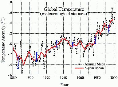
It's not really a record at all, but a statistical composite from station records from all over the world, most of them from towns and cities, and most from countries which do not maintain their stations or records properly. This record is compiled by the Goddard Institute (GISS) in the US. It indicates a global warming of +0.8°C. Is it real? Or is it just a statistical product of urban warming skewing the data, and bad site management in non-OECD countries? The pre-1940 warming is widely regarded to have been caused by the warming sun during the earlier part of the 20th century. |
 |
|
This is the combined record from hundreds of weather stations in the 48 states of the contiguous USA., the early 1930s being the hottest years of the 20th century. This is completely at variance with the global record shown above. (Both graphs were produced by NASA-GISS) Urbanisation has been more successfully corrected for in the US than in the rest of the world and the US also has the best maintained network of weather stations in the world. This must therefore be a better representation of the global picture too. The US record also agrees with the satellites (shown below) |
|
|
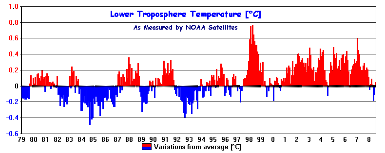
The newest and best way to determine global temperature is to use satellites to measure the temperature of the lower atmosphere, giving the Earth a uniform global sweep, oceans included, with no cities to create a false warming bias. This second method, used since January 1979, has a published margin of error of +/- 0.05 C/decade, and is clearly the best record we have. Here are Global Mean Temperature anomalies of the lower atmosphere for the 29-year period January 1979 to July 2008. It shows a very different picture to that of the global `surface record' over the same period. |
|
|
Global trend per decade
= +0.130°C,
(Northern Hemisphere = +0.197°C,
Southern Hemisphere =
+0.063°C.
)
(Caveat: Update 3 Jan 2008 from John Christy and Roy Spencer)
The actual
data from which the above graph is derived.
Northern & Southern Hemispheres
compared. See The
Surface Record: Global Mean Temperature and How it is Determined at Surface
Level by John L. Daly. (See `El Niño and Global Temperature', to see why some years are hot, and some are cool.)
|
Other Site Contents (Click the section label)
Storm Chasing in Tornado Alley - plus movie clip (2.7 MB download in .mov format) |
Climate Change in Antarctica - through the eyes of an 11-year-old reader of this website
![]()
Copyright John L. Daly, Jerry Brennan |