`Stop Press' Stories
For stories in 1999, click here
For stories January to April 2000, click here
For stories May to December 2000, click here
For stories January to April 2001, click here
For stories September to
December 2001, click here
For stories January to April 2002, click here
For stories June to September 2002, click here
For stories September to December 2002, click here
For stories January to June 2003, click here
For stories May to
August 2001, see below
![]()
![]()
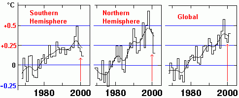
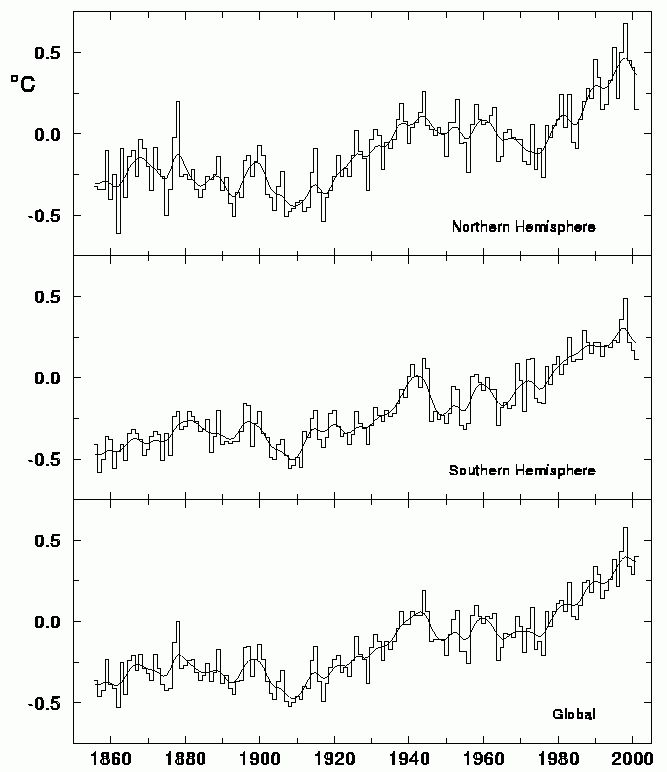
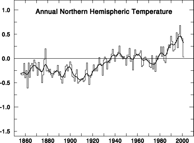
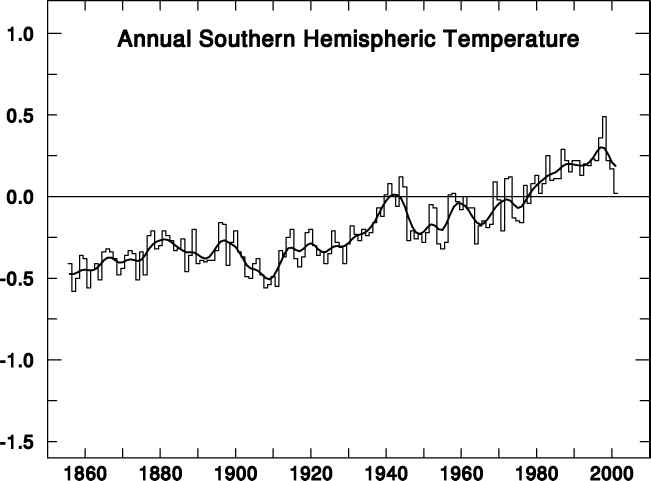
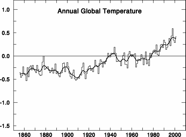
| CRU are the primary institution whose `surface record' is treated as gospel by the
IPCC,
and preferred over the super-accurate satellite record which shows
little warming in the NH and slight cooling in the SH. On CRU's own
website, they produced this graph, linked
as a postscript file, showing the NH, SH, and global temperatures.
They also published it as separate graphs in their online Climate
Monitor magazine, giving the NH,
SH,
and globe. The Climate Monitor was last updated on 5th August 2001. Above is the same chart with the last 30 years extracted out of the three graphs, aligned together and labelled to show how CRU's `global' temperature contradicts their own two hemispheric temperatures which make up that global picture. CRU found that even with their
disputed surface record, there was a sharp cooling in both hemispheres from a peak in 1998, but their global graph did not reflect this - instead it shows a resumed warming.
|
|
One solution to polluted drinking water is to simply not drink. That will reduce deaths from poisoning, but increase deaths
massively from dehydration. Their solution is therefore `no combustion' rather than `clean combustion'. The people `saved' by such a policy formula would be overwhelmed by those people lost through the resulting grinding poverty which would ensue from the loss of vital and economical energy.
|
|
The usual summer hysteria is on again in earnest. Hot days in parts of the US has the usual claims of global warming going the rounds, expressing surprise that some days in July and August actually get hot. But not everywhere. July 2001 was the second coldest on record at Binghamton, NY with an average temperature of 65.5°F. This is behind last year which was the coldest July on record. There have been many mornings with lows in the 40s. Some of the coldest valleys in the region even recorded minimum temperatures in the 30s at times. Out west in California,
a colder than average ocean continues to lurk off the California coast,
dragging down average temperatures in some places to the lowest levels in a
decade. Meanwhile, on the other side of the Atlantic, we have this little gem from Reuter's in France "PARIS (Reuters) 27 Jul 2001 - While environment ministers have struggled to salvage the 1997 Kyoto accord on global warming, nature has found its own answer in France, Le Figaro newspaper reported on Friday. Abnormally abundant winter snows have boosted production of hydroelectric power, allowing France to cut emissions of harmful carbon dioxide from traditionally fueled power stations by eight million tons in the first half of the year." |
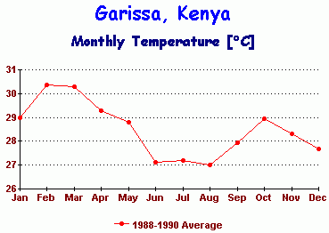 |
The modellers and the IPCC claim that `climate sensitivity' (the amount of temperature rise we would get for a given rise in energy) is about 1°C per `watt per square metre' (wm-2). Since a doubling of CO2 is claimed by modellers to increase atmospheric energy by 3.8 wm-2, it follows that the global warming the models would predict would be 3.8°C, right in the mid-range of the IPCC's predictions. That's where this record of monthly temperature from Garissa, Kenya, comes in. Garissa is a small town sitting almost on the equator, about 220 kilometres inland from the Indian Ocean. This means, the ocean cannot dampen temperature variations there. Being on the equator, it does not have the normal seasons associated with places further north or south as the sun is directly overhead twice a year. The Earth itself does not orbit the sun in a neat circle, but orbits in an ellipse, as shown left. The distance from the Sun varies between 146.5 million km in January to 151.5 million km in July, giving a 7% variation in solar energy due to the `inverse square law' of distance. At the equator, this results in a difference in absorbed energy of around 25 wm-2 between January and July. |
|
|
|
| Since
Garissa is on the equator, with a climate uncomplicated by
normal seasons, it should be especially responsive to this 7%
annual variation in solar radiation. But the temperature does not vary by
25°C as would be suggested by a climate sensitivity of 1°C
per wm-2. Instead it varies only 3°C
between a February peak and an August minimum. Thus, the
climate sensitivity at Garissa is only 3/25 = 0.12°C per wm-2, If this sensitivity is applied
globally, (even if we accept the IPCC
energy figure of 3.8 per wm-2 upon CO2
doubling) `global warming' would amount to a mere 0.12
x 3.8 = 0.46°C, not 3.8°C as claimed by the IPCC.
This low sensitivity response of Garissa (and
other places like it near the equator) includes the
effect of all possible positive and negative feedbacks from
clouds and water vapour.
This real-world sensitivity
figure of 0.12°C per wm-2 also shows up in many
other guises from latitude comparisons to field experiments,
to satellite temperature measurements. It means that
global warming, if it happens at all, will only be measurable
in tenths of a degree, not whole degrees.
0.45°C is hardly the stuff of catastrophe. |
|
|
"The glaciers are melting!". This a common mantra of the greenhouse industry. Green groups use dramatic TV footage of calving glacier fronts to claim that global warming is melting them away. There are thousands of glaciers in the world, some of them are receding (caused by global warming of course), and some of them are advancing (also caused by - you guessed it - global warming). The primary driver of glaciers is not temperature per se, but snow precipitation in the accumulation zones. Glaciers in Norway, Patagonia, Pakistan and New Zealand have been growing in the 1990s, while glaciers in Washington, Alaska, Peru and Africa have been receding. In other words, selectively choose the right glacier and you can `prove' anything. In the run-up to the Bonn talkfest, claims of `global warming melting a glacier' have been made about one in particular - the Franz Josef Glacier in New Zealand. Of course, many media organisations just repeat the Green propaganda without doing the journalistic thing and checking out the accuracy of the stories for themselves. In fact, the Franz Josef Glacier has been advancing during the 1990s, not receding. Here is the glacier in 1964 - And now, the same glacier in 2000 -
|
|
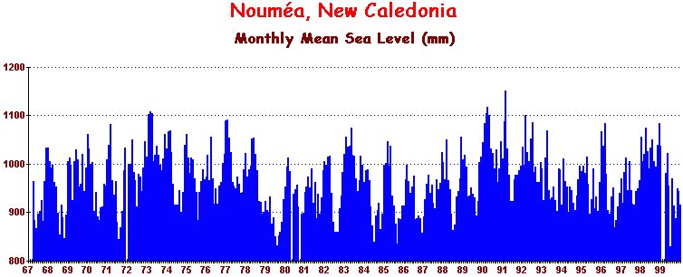
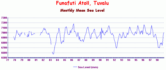
The Tuvalu government is at it again. With another climate conference for them to use as a platform, they have again claimed to the world's media that their islands are sinking in rising seas. The Greens joined the chorus of righteous outrage. Incredibly, no-one seems willing to do simple checks on that claim, accepting instead the hysteria from the Green lobby that the islands are drowning. A tide gauge installed at Funafuti Atoll, the main island in the group shows clearly NO SEA LEVEL RISE. (graph) Further west on the French island of New Caledonia, a tide gauge at Nouméa also shows NO SEA LEVEL RISE (graph) This is not the first time that Tuvalu has tried to pull this sting, but only by checking their claim against real data can it be seen for the falsehood it is. Significantly, they want `compensation', mainly from Australia. In their dreams. |
|
`Shooting the Messenger' (17 July 2001) The British journal
Nature (v.412, 12 July 2001) in an editorial titled `Shooting the Messenger'
has launched a vitriolic attack on climate skeptics, comparing them to
tobacco lobbyists. They said, "The IPCC has a creditable record of developing a scientific consensus and delivering it to policy-makers. What its critics really object to are the facts." |
|
|
|
But there are published, peer-reviewed, scientific reports from all over the world that a `Medieval Warm Period' early in the Millennium really did exist and was warmer than today. Likewise, there are published, peer-reviewed reports from all over the world that the `Little Ice Age' (LIA) of the Middle Ages was much colder than today. But this mountain of evidence is denied by the IPCC - it is they who run a mile from the facts, not the skeptics. Even though glaciologists routinely find and report evidence in the scientific literature of the LIA in glacier valleys, the IPCC ignores it all and insists it never happened. After all, they have a Green `consensus' to defend, and their `Hockey Stick' - itself a disgrace to scientific method - is central to that consensus. At the very least, to maintain some pretence of scientific standards, the IPCC should have acknowledged that their `Hockey Stick' claim is disputed, or merely a hypothesis. But no, they present it as an iron-clad `fact' - as if it were like gravity or relativity. Meanwhile, Nature cruises along with them in maintaining that farce. |
| Another
claimed IPCC `fact' is that the earth warmed +0.6°C in the 20th century, half of this
(+0.3°C) occurring since the late 1970s. But we have the more reliable
satellite monitoring and
radio-sondes since that time to test
the truth of that claim. These other two sources of
temperature data show that the real warming in the last 22 years was only
0.075°C, not 0.3°C, or only a quarter of that
claimed by the IPCC.
If the IPCC were genuine about their
pretensions to scientific rigour, they would at least admit that their claim
about a +0.6°C warming was based on only one of the three records, and therefore qualifies only as a disputed hypothesis, not a proven `fact'. Instead, they do the unscientific thing and pretend the other two data streams do not even count, giving no
explanation as to why they favour one record over the other two. Food Resources in 2080 ? (17 July 2001) Just in time for COP6 part II in Bonn, a new study published in Nature says that agricultural production in a warmer world by 2080 would see some big winners and some big losers, as shown on this map (red arrows etc. added). Canada is tipped to enjoy doubled agricultural production, along with Russia, Kazakhstan,
By presenting Britain as an agricultural loser, is it hoped that the Brits might be intimidated into complying with the `climate levy'? That suggests the study used political criteria in their country-by-country assessment. Nature, a British journal, saw nothing odd in this peculiar singling out of Britain for special `famine' status. But this is perfectly in keeping with their recently adopted apocalyptic vision on climate issues generally. A glance at the map shows how nonsensical this study really is. Countries with projected reductions in production lie right next to countries with projected increases, such as Algeria and Libya, both of which have similar climates.
Even the French, just 21 miles from Britain, gets increased
food compared with a growing famine in Britain. |
|
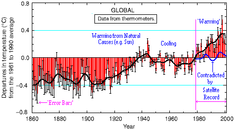
In a recent interview he gave to the PBS TV network in the U.S., Wigley said this about the above temperature history - "If I go back now and look at that record of global warming, it's true that over the period from about 1910 to 1940, there was very substantial warming, so much so that it cannot have been due only to human activities. But there are two other possibilities. It could be due to changes in the output of the sun. And, in fact, we believe that this is the primary reason for that warming." Wigley's admission is based on the fact that the increase in atmospheric CO2 was not significant up to around 1940. He referred to `human activities' rather than CO2 specifically during this period, since that could include such human activities as land clearing and agriculture. The IPCC claims a +0.6°C warming over the last 140 years, but they present that claim as if it could all be blamed on fossil fuels. However, it is clear from Wigley's remarks and from CO2 data on public record that anything pre-1940 could in no way be blamed on fossil fuels. This means that fully half of that +0.6°C warming was due to pre-1940 forcings, most probably the sun, as is now generally agreed by everyone. But was there really a warming of +0.6°C? The final 21 years of the above surface record shows a strong warming. However, it overlaps with the satellite data (thick blue line), which shows no such warming, leading to the obvious question as to whether the pre-1940 warming was as big as claimed. If the statistical processing of the surface record post-1979 could lead to an error of that magnitude in the surface record, the same processing procedures applied to pre-1979 data would in all probability over-estimate previous trends also. By contrast, the satellite record has been validated against independent radio-sonde data and is accurate to one hundredth of a degree. The surface record pales in comparison. |
|
Protocol Gets CPR (23 July 2001) Amid tears and hugs and kisses all round, the Bonn climate conference finally produced a diluted version of the protocol which Japan, Australia and Canada could wear. The price the European Union (EU) paid to get an agreement, any agreement, was full recognition for carbon `sinks' (forests and crops which eat up carbon), the main demand of the `Umbrella Group' including Australia and Canada. Another sticking point, that of penalties for target non-compliance, has also been watered down to accommodate the Umbrella Group. The protocol is now a mere shadow of the original. According to the BBC - "In its present form ... it is more of a symbol than a battlecry." When the Kyoto Protocol was first agreed in 1997, there were the same conference celebrations by exhausted delegates, the same hugging and kissing, the same euphoria. Then, over time, nothing seemed to happen - nobody was ratifying it, not even Australia who had the easiest deal of all. Now we see the same conference euphoria, the same hugging and tears, and it is easy to get a sense of déja vu of 1997 all over again. With one big difference. This time the USA is not on board. As the months go by, the EU will find that is they, not the USA, who will be the Third World's milking cow under the complex scheme of technology transfers, carbon credits trading, and other subsidies that they hoped would mostly be borne by the U.S. taxpayer. Without the U.S., the protocol is ineffectual, and ratification is still likely to be a problem for many countries regardless of the somewhat premature celebrations in Bonn. Ironically, EU intransigence at the Hague in November led them to reject a deal which was much tighter than this one, and which would have included the U.S. Now they have had to agree to a face-saving shadow of the original, and do so without the USA. |
Réchauffement de la Plančte? - Non! (6th July 2001)
Away from Tasmania, out in the Pacific Ocean near Fiji, is the large French
island of New Caledonia.
It's capital
Nouméa has recorded sea level there since 1967.
Here is what they have to say about the IPCC's `sea
level rise'.
|
Echo of Orwell (7th July 2001) George Orwell in his dark futuristic novel `1984' portrayed a society in which the past was routinely altered to serve the political vagaries of the present. The greenhouse industry has now resorted to altering the past in a bid to portray the present as alarming. They began in 1998 with the notorious `Hockey Stick', altering the climatic history of the last 1,000 years to suit today's warming scenario. Now, they are at it again. Researchers from Lawrence Livermore Labs, including Benjamin (`Chapter 8') Santer, have now used their model (yes, another model) to suggest that temperatures earlier in the 20th century were cooler than we think, - thus implying our present is warmer than we think. `Change the past to serve the politics of the present'. George Orwell would turn in his grave at the cynical way in which his vision is being brought to reality by the huge greenhouse industry. The Isle of the Dead - 160 Years On (1st July 2001) Today, 1st July, is the 160th anniversary of the striking of the sea level benchmark in 1841 on the Isle of the Dead, Tasmania, by Captain Sir James Clark Ross and his associate Thomas
Lempriere. Since Tasmania is stable geologically, land uplift cannot explain why the benchmark fails to support the IPCC. Even worse, the benchmark suggests a sea level fall. The lead author of the 2001 IPCC Report on sea levels is Dr John Church of the University of Tasmania, whose office is only 40 miles from the benchmark, and who is fully familiar with it. In spite of a dearth of historical sea level data from the southern hemisphere, and indeed from the whole world pre-1900, the IPCC silence on the Isle of the Dead is quite deafening. |
|
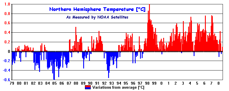
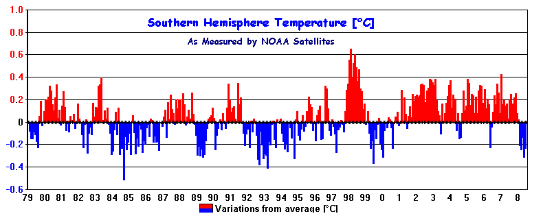
According to the latest `news' from NOAA (15 June 2001) - "During the period March through May, the global average temperature was the second warmest on record, or 0.53C (0.95F) above the 1880-2000 mean. The month of May was also second warmest globally with a temperature that was 0.41C (0.74F) above the long-term average." What next? - The warmest July 4th? The wettest December 5th? The windiest 4pm on August 20th? The above NOAA statement completely ignores the fact that this applies only to the faulty surface record, cobbled together from thermometer readings, gathered from mostly third world countries and ship buckets over the last 120 years. But we have satellites now which are accurate to one hundredth of a degree - but only since 1979. Here is the satellite verdict for both the `March through May' period and `May only' from 1979 to 2001 |
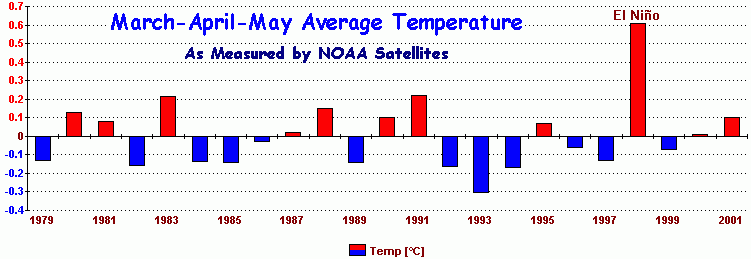
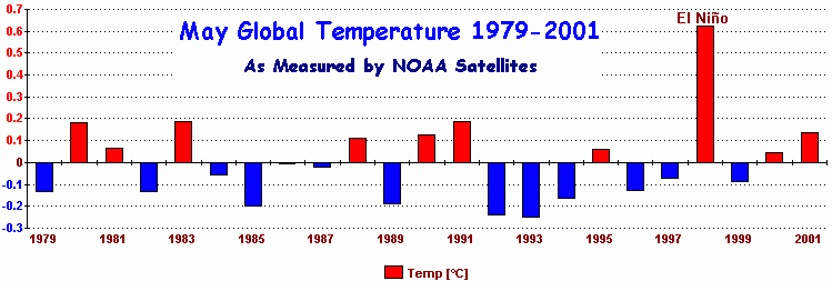
|
As we can see, both `March through May' (only the 7th warmest since 1979) and `May only' (the 5th warmest since 1979) are in no way remarkable in 2001 (the final bar). And this only covers 23 years. 1998 stands out alone as especially warm due to the big El Nińo of that year. This obsession by the greenhouse industry with trawling the surface statistics to find new `records', any records, are nothing but propaganda designed to keep the public in a heightened state of anxiety. They have no scientific worth whatever. The fact that the NOAA keeps quiet about their own satellite results, indeed to pretend they do not even exist, is a quite deplorable abuse of the public trust on their part. |
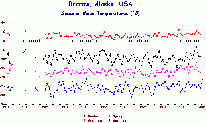
This weeks scare story comes from `Nature' (v.411, 31 May 2001, p.546) in a paper by Sturm et al. titled `Increasing Shrub Abundance in the Arctic'. The title sums up the content of the paper. Well, perhaps the title was a little ambitious. They surveyed an area of a mere 320 km2, equivalent to a square block of land 11 miles by 11 miles.
Their opening statement was equally sweeping - "The warming of the Alaskan Arctic during the past 150 years has accelerated over the last three decades." Here is the annual and seasonal temperature record for Barrow, Alaska, about as Arctic as you can get there. The record is only reliable for the last 80 years, the previous 20 years to that being very fragmentary, so their claim of 150 years of warming is quite spurious, as is the alleged `acceleration'. 1998 stands out as a warm year in isolation due to the big El Nińo of that year, but that hardly rates as a 30-year `acceleration'.
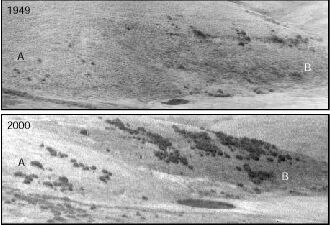
What of the shrubs? They provided two examples of `repeat photography' to show an increase in vegetation in previously barren regions which they promptly blamed on `climate change'. So, Life is bursting out all over - and that's bad news? Here (left) is one of the examples they used - But guess what, this is exactly the same phenomenon which has been observed all over the world, including the United States, caused not by climate, but by CO2 enrichment of the atmosphere. The `fertiliser effect' of CO2 is the only prediction which is not only fully validated, but is already happening.
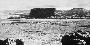
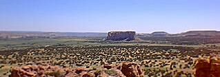
Below is an example of CO2 fertilisation at work in the country surrounding Enchanted Mesa in New Mexico -
Enchanted Mesa in 1899 (left) and today (above). Note the expansion of vegetation. This is happening all over the West.Other examples of `Repeat Photography' are available on the internet. The Utah State Office of the Bureau of Land Management have a particularly good collection, also this set from Wyoming. To see the beneficial effect atmospheric CO2 has had on vegetation growth, click these `before and after' photos from Utah -
The `gloom and doom' mindset claims that life on Earth is threatened by all sorts of threats from human activity. These photos, both in the Arctic and in New Mexico prove quite the opposite - Life is thriving - and expanding.
While the National Academy of `Science' (NAS) was playing obedient monkey to the UN IPCC organ grinder (see story above), Mother Nature has been having her own say in the same U.S. of A. that the NAS inhabits.
My Chicago informants bring an interesting story from the `windy city'.
An unprecedented cold has hit the Chicago area since May 22. Last Tuesday, Chicago recorded the coolest high temperature for June since 1979 with a high of only 58°F. A new record was recently set for the most consecutive number of sub-60°F (4 in total) highs so late in the spring.
Also, Chicago blew a long standing record off the books by reaching 17 consecutive sub-70°F highs. From 22nd May through 7th June, temperatures never reached the 70°F mark. The previous record was 15 days set way back in 1889. By Friday 8th June, the misery for Chicagoans ended when the day's high reached 73°F.
It's worth noting that temperatures recorded in the late 1800s and early 1900s were taken near the lakefront of Lake Michigan, whereas now they are taken at the huge O'Hare Airport at the northwest edge of the city. This makes the record even more remarkable given that major airports have local heat islands, whereas the former lakeshore site was subject to cooling influences from Lake Michigan. For example, Thursday's 68°F high at O'Hare Airport
compares with only 63°F at the lakefront site.Temperatures are forecast to rebound next week to more normal levels, but it was amazing to many residents to have to re-fire domestic furnaces so late in the spring with lows dropping to near 40°F in the suburbs.
A similar pattern of anomalously cold, wet weather was reported further west from Missouri.
(Thanks to George Sumyk and other sources for the intel.)
European dis-Union (4 June 2001)
According to Britain's `Independent', the monolithic unity which the European Union has maintained in favour of the Kyoto Protocol has now been fractured. The new Italian government, led by Prime Minister Berlusconi, has expressed support for the policy of U.S. President Bush in rejecting the Kyoto Protocol.
Shortly after the announcement by President Bush that the U.S.A. would no longer support the protocol, the E.U. has continued a blind `go-it-alone' policy by threatening to ratify the protocol anyway without U.S. participation, in the hope that European ratification would act as a political lever to move the U.S. position.
The latest policy of the Italian government runs counter to the rest of the E.U., particularly the Italian insistence that any climate policy can only be achieved with the participation of the U.S. and that Europe should be prepared to discuss any new proposals from the U.S.
Today, radical environmentalists will be celebrating. The U.S. National Academy of Science (a somewhat devalued title by now) has just released a report by a selected committee of climatologists who were commissioned by President Bush to provide an independent U.S. assessment of the current state of climate science.
While many in the climate community hoped for a more balanced or critical approach to the IPCC, the National Assessment, and an earlier report by an NAS panel on the surface-satellite conflict, all we got today was a 100% endorsement of the IPCC and its processes, including the infamous `Summary for Policymakers', full endorsement for the discredited `National Assessment' (which even most climatologists could not stomach), and full endorsement for the earlier NAS report on surface-satellite temperatures conflict.
This report contained no new science, no new evidence, and most critically - it did not address in any detail a single point of contention raised by global warming sceptics. Specific problems with this latest report are - (quotes in red)
"Temperatures are in fact rising" - Only according to the surface record, mostly from third world instruments. The satellite record shows little or no warming, and the surface record from the U.S. shows a climate today little different to what it was 70 years ago. This remark confirmed the committee's support for the surface record - no reason given.
"There is general agreement that the observed warming is real and particularly strong within the past twenty years." With this remark, the committee have clearly rejected the satellite temperature record outright, with not a single reason offered. Because the satellites show no strong warming `within the past twenty years', the committee clearly have given 100% blessing to the disputed surface record - without so much as a reason to justify that choice.
"The committee generally agrees with the assessment of human-caused climate change presented in the IPCC Working Group I (WG1) scientific report." - So they toss the ball back into the IPCC court, choosing not to raise a single point of criticism of that over-politicised UN body. This is hardly surprising as several committee members were themselves involved in the IPCC process.
"The committee finds that the full IPCC Working Group I (WG 1) report is an admirable summary of research activities in climate science, and the full report is adequately summarized in the Technical Summary." The IPCC summary was also highly selective, choosing to summarise only those research activities which reinforced the IPCC mindset. That this NAS committee should find it so admirable clearly establishes them as ideologically pro-IPCC with no scientific justification offered. They gave no reasons for the selectivity exercised by IPCC reviewers, accepting some research studies, but ignoring others.
"After analysis, the committee finds that the conclusions presented in the SPM and the Technical Summary (TS) are consistent with the main body of the report." - Again no discussion of the numerous points of difference between the two IPCC documents raised many times by sceptics. The SPM and TS are clearly incompatible in many respects, but the committee again resorts to endorsement without justification.
On sulfate aerosols, whose effects are highly disputed - "The monitoring of aerosol properties has not been adequate to yield accurate knowledge of the aerosol climate influence." This is an admission that little is known about these aerosols, but the committee did not proceed to find any fault with models which use those aerosols to prevent the models from over-heating their virtual earths beyond existing real climate. Those aerosols are used in the models like an accountants `balancing item' in a balance sheet, and are assumed to be real only in order to keep the models in some kind of agreement with current climate. The committee should have been more detailed on this issue, given their admission that little is known about the effect of aerosols in the real world.
On solar forcing, the direct effect of which the committee claims to be small (+0.3 w/m2), they dismiss the well published secondary feedback effects of solar forcing - "Numerous possible indirect forcings associated with solar variability have been suggested. However, only one of these, ozone changes induced by solar UV irradiance variations, has convincing observational support." With these dismissive words, the entire body of published and peer-reviewed solar science built up over the last ten years is thrown out - without so much as an explanation.
On the `National Assessment' - "The U.S. National Assessment of Climate Change Impacts, augmented by a recent NRC report on climate and health, provides a basis for summarizing the potential consequences of climate change." The National Assessment has been one of the most criticised climate documents of recent times. It was attacked not merely by global warming sceptics, but also by scientists normally sympathetic to the IPCC and the global warming scenario. It was a manifestly political and alarmist document and exceeded even the alarmism normally associated with radical environmental groups. But this NAS committee endorses the National Assessment. More shame to them for doing so.
On the delicate issue as to why the satellites and surface do not agree as to recent warming trends - "The finding that surface and troposphere temperature trends have been different as observed over intervals as long as a decade or two is difficult to reconcile with our current understanding of the processes that control the vertical distribution of temperature in the atmosphere." With these mealy-mouthed words, the committee put themselves squarely in the business of pseudo-science, not science. Having admitted they could not understand why the satellites measuring the free atmosphere were producing a different trend to the surface record, this lack of understanding did not compel them to question the validity of the models which depend critically on an assumption that an enhanced greenhouse must warm the troposphere first, before the surface warms. What has been observed is quite the reverse. From this, it requires no great leap of thinking to conclude that either the models are working to a completely false premise, or else the surface record itself is wrong, or both. Either way, having endorsed the models without explanation, and having endorsed the surface record again without explanation, they could only pass off this fundamental conflict with the inane and worthless comment given above.
In conclusion, the NAS committee made many assertions, none of which they chose to justify or explain other than to state it was `their view' - as if their mere authority as representing the National Academy of Science were enough to prevail in the argument.
Well it isn't. The days when mere `authority' could win an argument or debate are long gone. Such deference is more characteristic of a medieval priesthood, not a modern science where every important claim must be justified and explained. Only evidence counts in this modern world, and this committee have provided none, merely re-stated what has already been stated in politically contaminated documents by the IPCC and National Assessment.
For that reason, the National Academy of `Science' hardly deserve their name any more.
See also - The U.S. National Academy of Sciences Issues a Distorted Report -
Comments on the National Academy Report on Climate Change by Prof S. Fred SingerSee also - `The Press Gets It Wrong: Our report doesn't support the Kyoto treaty'.
by Richard S. Lindzen, Monday, June 11, 2001 12:01 a.m. EDT, writing in the Wall Street Journal
When it comes to the weather, they do not come much more expert than English cricketers. Only God knows how a game designed for long dry summers could possibly have been invented in England. Australia is ideal for the game, which explains their success at cricket.
However, English cricketing history is a mine of climate information, and published in the latest edition of the English Cricket bible `Wisden Cricketers' Almanack 2001.'
According to Philip Eden, a meteorologist writing for the almanack -
"The weather of summer 2000 came in for a lot of flak, and not just in cricketing circles.
It repeatedly made the headlines, often being described as the 'worst in living memory' or the 'worst since records began'. The former I shall not comment on, save to say that 'living memory' is a notoriously poor tool for making useful comparisons, but the worst since records began it manifestly was not.
According to the Wisden summer index, 57 of the previous summers were better and 43 were worse. Quite why the public and media opinion was so convinced that summer 2000 was unprecedentedly bad is perhaps better answered by a psychologist than a meteorologist."
This year, 2001, will see an `Ashes' clash in England between Australia and England. If England wins (a highly unlikely outcome) it will be a `better than usual' summer for the English. If they lose, they can always blame it on global warming.
(Thanks to Charles Davis for the intel.)
Low CO2 Growth in 2000 (3 June 2001)
For months, we have been waiting for the year 2000 CO2 growth figures from Mauna Loa, but so far they have not been published.
However, Mauna Loa is not the only place in the world where CO2 is measured. At Jubany Station, Antarctia, the figure for atmospheric CO2 growth in 2000 was only 1.04 ppm.
This compares with the value of 2.14 ppm increase for 1998, partly caused by the strong El Nińo of that year.Since 2000 was described as `warm' by the greenhouse industry, it is all the more significant that CO2 growth should fall to 1.04 ppm in spite of that `warmth', and the strong economic activity of that year.
The predictions of the IPCC that the world may be up to +6°C warmer due to rising CO2 by the year 2100 are based entirely on climate models. These models in turn rely on one key assumption - that CO2 will grow at 1% per year. That means CO2 in 2000 should have risen +3.68 ppm, not 1.04 ppm. In fact, CO2 has never risen in any single year by that 1% target figure.
The 2000 rise is only +0.28%, far short of the figure assumed by the models. This means it may be 2450 AD before that IPCC prediction can be fulfilled.
"We are the ones that live closest to the land,
to Mother Earth.
We live with it, we experience it, with our hearts and souls, and we depend upon it.
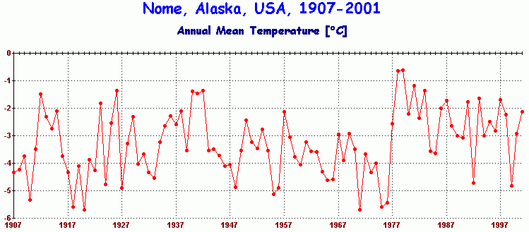
When this Earth starts to be destroyed, we feel it."- Caleb Pungowiyi, Yupik Native from Nome, Alaska.
These were the heart-tugging words of an Eskimo native as quoted on page 81 of `Climate Change Impacts on the United States' - better known as the `National Assessment'. On page 70, they state - `Caleb Pungowiyi is a Yupik Eskimo who lives in the Arctic, moving back and forth from Alaska to Siberia in pursuit of walrus and other sea mammals. Gathering food directly from the land and the sea makes the Yupiks very careful observers of what is going on around them.' The intended human image from this characterisation? A hardy, but wise, Eskimo living close to nature in a traditional Eskimo lifestyle, imparting his ancient wisdom to a `greedy' unfeeling industrial society.
But the reality? Let Caleb Pungowiyi describe himself. Here is his own opening introduction to his testimony before a U.S. House of Representatives sub-Committee on 6th April 2000.
"Good morning Mr. Chairman, and members of the Subcommittee. My name is Caleb Pungowiyi. I currently serve as a Special Advisor on Alaska Native Affairs, to the Committee of Scientific Advisors for the Marine Mammal Commission and am a former member of the Alaska Scientific Review Group. I am also a member of the Indigenous Peoples Council for Marine Mammals (IPCoMM), and a life-long subsistence user of marine mammals. I am testifying today in my capacity as Chair of IPCoMM's Marine Mammal Protection Act (MMPA) Reauthorization Committee, and as a Consultant and former Executive Director of the Eskimo Walrus Commission."
It seems Caleb Pungowiyi is not what the National Assessment made him out to be. Even his home town of Nome fails to show global warming in its instrumental record, hardly evidence of the `destruction' he mourns in the opening quote. A full read of his testimony reveals someone well versed in the ways of scientific and political bureaucracy, a well-connected and tertiary-educated career bureaucrat, not the `noble native' image painted by the National Assessment.But it gets worse. Look up this website to see how Pungowiyi and his organisation operates when it comes to the commercial exploitation of Alaska's wild life. In Tasmania, we provide absolute protection to our unique wildlife, but then, we don't have Pungowiyi's ancient wisdom to persuade us to do otherwise. Tasmanian Devils are not for sale, but Alaskan walruses? They would be a lot safer here - as far from Pungowiyi as possible.
Like everything else in the discredited `National Assessment', the beatification of Caleb Pungowiyi to evoke sympathy for the global warming cause was an act of political deception of the American public.
Sinking The Trees? (27 May 2001)
The primary issue upon which the Hague Climate conference failed late last year was that of `sinks'. The `umbrella group' (USA, Canada, Australia) pointed out that their ability to offset CO2 emissions through increased forest production should be taken into account in any calculation of a country's net emissions.
Most, if not all, of current U.S. emissions are consumed by increased forest production in the U.S. However, the European Union and Green groups malign the U.S. as the `world's biggest emitter' when they ignore the fact that the U.S. is also one of the world's biggest sinks, something the European Union is definitely not.
In other words, in net terms (emission rate less sink rate), the U.S. is one of the smallest net emitters, while the E.U. is arguably the biggest net emitter of all.
With convenient timing, the British journal Nature this week (v.411, p.466, 24 May 01) published two papers, plus an overview article, to tell us all that maybe forests don't soak up as much CO2 after all. They report experiments on a single tree species, Loblolly Pines, in which it is claimed that lack of soil nutrients limits a tree's ability to store away carbon, particularly since some forests are in poor soil environments.
Of course, these papers should be seen against a backdrop of a mountain of other scientific evidence which says that trees and vegetation increase their productivity and water efficiency under enhanced CO2. However, the experimental details of the Nature papers show them to largely confirm what is already known about CO2 fertilisation. The rest was just media spin.In the experiment, the Loblolly Pines were given enhanced CO2 (550 ppmv compared with the present 370 ppmv) under free atmosphere conditions and they grew a whopping 34% more than an unfertilised control group during the first three years.
But then, the growth slowed. During the next 4 years, the growth was `only' 6% greater. The authors say the soil on which the trees stood was `moderately low fertility', and less than 0.3m deep, or about 1 foot for the overcrowded roots to occupy.
The media spin made from this trio of articles was like asking "Is a glass of water `four-fifths full'? - or `one-fifth empty'?"
Far from devaluing the `sinks' case of the umbrella group, these results powerfully confirm it. In the space of only 7 years, those Loblolly Pines grew 40% more than nearby pines in non-enhanced CO2 conditions, and did so in a soil of poor fertility only a foot deep. That's a big sink in anyone's language.
`A Touchy Question' (20 May 2001)
`A touchy question' is how the journal Science described a paper by David Hodell et al. (Science 292, 1367) who reported a direct causal link between the collapse of the Mayan civilisation due to drought, and variations in the Sun's brightness.
According to Science, "Tackling a touchy question outside the mainstream of opinion usually gives a scientist pause." They followed that with a summary of the paper's findings finally concluding that it "... should go some ways toward making sun-climate a less touchy subject."
`Touchy', because the greenhouse industry is in a state of permanent denial of any link between the variable sun and the Earth's climate. To admit to the significance of such a link would throw their models and their predictions completely askew. It would also provide a competing explanation for the claimed global warming of the 20th century.
As if the Hodell paper was not enough, another sun-climate paper by Neff et al. has just been published in Nature (17 May, v.411, p.290) which studied cave stalagmites in Oman. By comparing 18O and 14C isotopes in the stalagmite, they found that solar radiation was the primary driver of changes to the Asian Monsoon 6,000 to 9,000 years ago when the stalagmite was created.
Sun-climate linkage is indeed `a touchy question'. It's interesting that Science should even admit to it because even they now seem to recognise that when it comes to global warming, political correctness dominates the science.
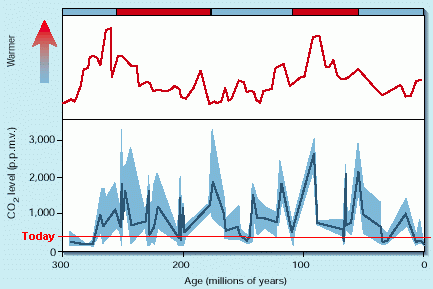
The Good Old Days (20 May 2001)
In a new paper in Nature (v.411, p.287, 17 May 2001), Gregory Retallack compared leaf stomata of Ginko trees with similar stomata from fossil remains of related ginko trees as far back as 300 million years. From this, he was able to reconstruct the history of atmospheric carbon dioxide as shown left. Today's CO2 level (370 ppmv) is added (horizontal red line), and it is readily apparent that CO2 in the distant past reached between 2,000 and 3,000 ppmv, or up to 10 times the pre-industrial level of 280 ppmv. And we are paranoid about a mere doubling to 560 ppmv in the next 150 years. If anything, our present level of CO2 is very low by geological standards (perhaps even dangerously low during recent glaciations).
The above graph compares CO2 (solid blue line, with standard deviations shown in shaded blue) with a low resolution temperature chart covering the same period. The author concludes in his abstract - "These results support the role of water vapour, methane, and CO2 in greenhouse climate warming over the past 300 Myr." These are carefully crafted words, given the editorial policy toward global warming of the journal he was publishing in. CO2 was mentioned only as a third factor, the primary role being attributed to water vapour, a very safe and correct choice to preserve the integrity of his findings.
But what else do we find in the above chart? The resolution of the CO2 chart is coarse, ± 6 million years, but even with that caveat, it is clear that as with many other palaeo-climate studies comparing CO2 with temperature, this study shows the same tendency for temperature changes to lead CO2 changes. This is apparent as a `right shift' in the CO2 chart when compared with the temperature chart above it. This means that the CO2 changes were caused by the temperature changes, not the other way around.
It is also apparent that the Earth cruised through periods of very low CO2 (such as today) and periods when CO2 was up to ten times greater, with no ill effects to the climate. Indeed, the Earth was more biologically productive during the high CO2 regimes (it needed to be to support all those hungry dinosaurs). This provides us with the confidence that higher levels of CO2 (but still low by geological standards) will have no ill effects on the Earth's climate, but make the Earth much more productive biologically. The greening of the Earth is the only significant consequence of rising CO2.
The greenhouse industry and the media loves to announce weather records, especially `hot' records (the hottest here, the driest there etc.), but become strangely silent when `cold' records are broken (such as the coldest winter in 50 years this year in Russia). This morning (23 May 2001), Tasmania scored a record low temperature for May.
Early this morning, Launceston Airport in northern Tasmania reached a minimum temperature of - 4.8°C accompanied by a severe frost. According to the Australian Bureau of Meteorology in Hobart, Tasmania, this is an all-time record low temperature for May.
The previous record low for May was set on 31st May 1959 (the last day of autumn), with a temperature of -4.7°C.
"We Kill Ozone Like No Other Country" (18 May 2001)
This was the strident headline in Australia's national newspaper, `The Australian' on Thursday 17th May.
According to their environment writer, Amanda Hodge, "The latest five-year energy consumption snapshot, released by the Australian Bureau of Statistics, shows each Australian produces four times the world average of ozone-depleting carbon dioxide emissions."
Carbon dioxide as an ozone depleter? This was news to everyone in the climate community.
Her source of scientific information appears to have been Nicolette Boele of the Australian Conservation Foundation who is quoted as saying "this is a red-hot message to the Government that we must ratify the Kyoto protocol."
With such a hopelessly garbled confusion between the greenhouse and ozone issues, the `red hot' message is more egg-coloured. Since `The Australian' is the premier newspaper in Australia, such messy reporting is simply not good enough and the public deserves better.
U.S. Senate Hearings on Climate Policy (6 May 2001)
The U.S. Senate Commerce Committee has been taking evidence from expert witnesses over the last week including IPCC participants and climate sceptics alike. James Hansen of NASA-GISS has already suggested that the National Academy of Sciences should be the primary scientific body to advise the U.S. government on climate science - not the IPCC. Hansen has also advocated an alternative policy response to that of the Kyoto Protocol, with a near-term focus on elimating smoke and methane pollution rather than CO2. On calls for immediate cuts to CO2, he said in part:
"It is impractical to stop CO2 from increasing in the near term, as fossil fuels are the engine of the global economy."See the testimony of James Hansen here (downloadable .pdf file, 1.45 MB)
Prof Richard S. Lindzen, currently one of the scientific authors with the IPCC was nevertheless highly critical of the way the IPCC functions and of the manner in which climate science has become addicted to scaremongering -
See his full testimony here - Testimony of Prof Richard S. Lindzen, given 1st May.
At the hearings, Senator Ted Stevens (Alaska) claimed that Barrow, Alaska, the most northerly point in the USA, facing directly onto the Arctic Ocean, was suffering `a creeping disaster' from global warming. He says they had their very first thunderstorm recorded there last June, and that Barrow would soon have to be evacuated due to rising seas.
On the thunderstorm, Stevens was wrong. Barrow has had three thunderstorms since 1978, one on July 22 1989, another on July 18 1995, and last year's on June 19 last year - Details here. On sea levels, Stevens omitted to tell the senators that Barrow itself sits on a narrow spit of land surrounded by eroding marshes and is barely 2 feet above sea level. This makes Barrow vulnerable to even natural surges in sea level. Tide gauge data from Prudhoe Bay on the same coast shows no rising sea level at all, but does show an annual variability of about 20 inches. The coast around Barrow is also subject to coastal erosion, which is not the same as sea level rise.
See - A Clap of Thunder - the story of the infamous Barrow Thunderstorm and what followed.
What Do We Want? - Warming! When Do We Want It? - Now! (19 May 2001)
It may sound an odd demand, but that's what the residents of Kirkenes, a small Norwegian town on the Arctic coast of Norway right next to the Russian border, are demanding.
According to the Norwegian tabloid newspaper `VG Oslo', (18 May 2001), the townspeople are upset because of the loss of business and tourist income resulting from the official weather forecast consistently making Kirkenes up to 6°C colder than it really is. The reason is that the official temperature for Kirkenes, displayed on national TV, is taken at the airport 14 kilometres away at a higher - and colder - altitude. The town mayor, Alfon Jerijervi, is demanding that the station be moved to the centre of town and so allow the Norwegian TV public to see how `warm' and inviting Kirkenes really is.
`Not likely', says Bĺrd Fjukstad, the spokesman for the Norwegian weather service, `we don't have the money'. Besides, he says, similar demands are coming from Bodö and other cold places in Western Norway.
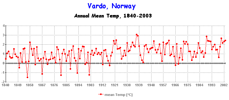
Seems the people of Kirkenes will have to wait for the real thing before they get the warming they want - and judging by the lack of warming at nearby Vardř, that could be a long, long wait. (thanks to Jo Sivertsen for the intel.)
|
|
CSIRO - Pontius Pilate PhD. (10 May 2001) Aussie policymakers and pollies - read carefully the `disclaimer' on the left. This was printed at the bottom of the last page of the CSIRO's glossy brochure `Climate Change - Projections for Australia', a brochure full of dire warning of plagues, pestilence, droughts, floods, and heat waves, based on a CSIRO `model'. |
 |
This latest foray by
the Atmospheric Division of Australia's CSIRO (Commonwealth
Science and Industry Research Organisation) as presented in
their latest brochure and media
release, paints a picture for a future Australia of a land racked
in heat waves and droughts, a drying out and heating up of a continent
already too dry and too hot. They have dived right into the
realm of policy and politics with a vengeance - in direct opposition
to the Australian federal government's policy on the Kyoto Protocol,
something CSIRO has absolutely no right to do as paid public servants.
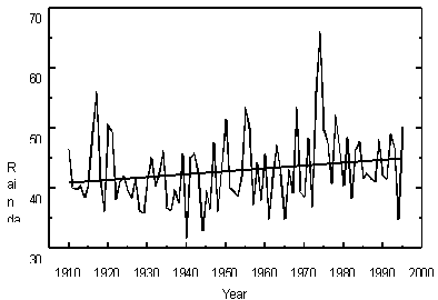
But only 2 years ago, their spin (and their models) was playing a much different tune as |
shown by this April 1999 press release from the CSIRO. They drew attention then to the fact that Australia was becoming WETTER - thanks to global warming, as shown by the national rainfall graph they presented (shown left). Great news for the driest inhabited continent.Now, their models and modellers have miraculously shifted gear and predict that Australia will now be DRIER - knowing full well that most Australians fear heat and drought more than they do floods and cool weather. Political opportunism by any other name.
In their latest `projections' they do not explain how or why they made such a U-turn. But then, they always have their `disclaimer' to fall back on.
|
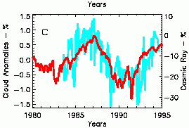
The Light of the Silvery Moon (3 May 2001) NASA researchers have found a new way to measure the albedo, or reflectivity, of the Earth (GRL v.28, no.9, p.1671, 2001). By measuring `Earthlight' reflected off the dark side of the moon, the Earth's albedo (i.e. Earth's ability to reflect sunlight) can be determined. The brighter the Earth is, the brighter is the dark side of the moon and vice versa.
Photometric observations since December 1998 of Earthlight gives an average
Earth albedo of 29.7%, very close to earlier estimates of 30%. (ENN
report) Henrik Svensmark of the Danish Space Research Institute, has shown that low clouds (blue) increase and decrease as cosmic rays (red) from deep space increase and decrease.
Researchers at Lawrence Livermore, California, say that deforestation over centuries may have caused the cooling between 1000 AD and 1900 AD. According to their media release in the National Post online, (26 Apr 2001), `scientists have long recognized that the Earth's climate cooled up to 1.1°C between AD 1000 and 1900'. Oh Really? According to the IPCC, the world warmed
+0.6°C since 1900, which means it was 0.5°C
warmer in 1000 than it is today. Another nail
in the `Hockey Stick'. |
![]()
Return to `Still Waiting For Greenhouse' main page


