Global
Warming. What Evidence?
![]()
|
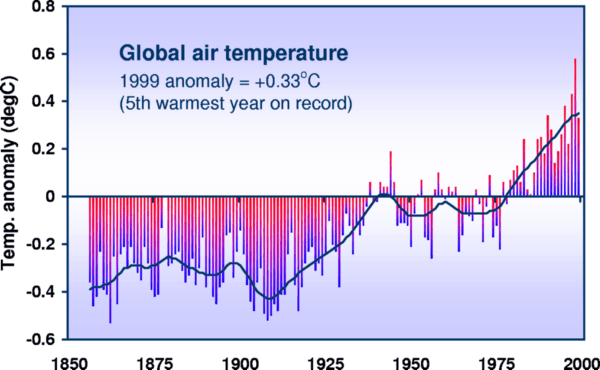
The most often cited evidence that the surface of the earth is warming is the global record resulting from a combination of many weather station and ship measurements Figure 3.1 gives the latest version supplied by the Climate Research Unit, University of East Anglia (1)
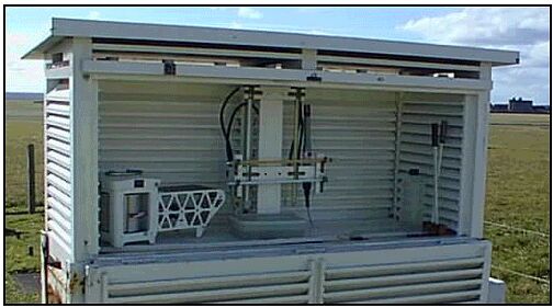
Figure 3.1 Global surface air temperature, as compiled by the University of East Anglia (1) This graph is reproduced, in one form or another, no less than nine times in Chapter 2 “Observed Climate Variability and Change” of the 2001 IPCC Report (2). It is also reproduced frequently in press articles about global warming. It is therefore important to discuss in some detail whether its claim to represent the mean surface temperature of the earth can be justified. Temperature records of local weather were established soon after the invention of thermometers and temperature scales in the eighteenth century. Early thermometers were unreliable and difficult to calibrate (3, 4,5). Liquid-in-glass thermometers required a capillary tube of uniform diameter and a clearly divided scale. Glass is a cooled liquid which slowly contracts over time. Liquid-in glass thermometers therefore read high if they are not frequently calibrated. This is true even of modern thermometers with improved glass. The earlier measurements, up to 1900 or so, would have been made on thermometers calibrated in single degrees (usually Fahrenheit), made from ordinary glass. One possible reason for the rise in temperature shown between 1910 and 1940 is the difficulties of calibration of thermometers in remote parts of the world during the two world wars. The early measurements were made mainly near large towns in the Northern Hemisphere. Even today, measurements are not available for many regions of the earth’s surface, particularly those remote from cities and buildings. The instrumentation used to measure temperature in weather stations has hardly changed for over a century. Figure 3.2 shows the equipment currently in use at the airport on the Isle of Man. On the left is the apparatus for measuring relative humidity, dependent on the properties of human hair, invented by Benjamin Franklin in the later 18th century. Then Six’s maximum and minimum thermometer and the wet and dry bulb thermometers go back to the same era. The equipment is contained in a Stevenson’s screen, invented by Robert Stevenson, the great lighthouse engineer and father of the author Robert Louis Stevenson, in the early part of the 19th century. At that time thermometers were often placed in direct sunlight, or on the walls of buildings. Change to the general use of the Stevenson screen took many years. Figure 3.2 Equipment for weather monitoring currently in use at the airport, the Isle of Man. The screen is painted white, intended to minimise heating by the sun, or loss of heat at night to the atmosphere. However, a white painted surface is not a perfect reflector or a zero emitter. White paint absorbs 30 to 50% of the sun’s radiation, so solar heat contributes to the temperature measured inside the screen, particularly on a still day with little air circulation. It will increase with time as the paint deteriorates or gets dust on it,. or the louvres develop cobwebs. The emissivity of a white painted surface is 85 to 95%, almost as high as black paint. On a still cloudless night the box will cool below the air temperature and influence the thermometer. The
air entering the screen will have exchanged heat with any neighbouring
buildings, roads, vehicles, aircraft. It will be affected by the
locality, urban or rural, and by any shelter around the site. All these
properties can change over time, so influencing the measurements. Most
of the changes will tend to increase the measured temperature. In
order to read the instruments, the door must be opened, so changing the
air properties within the box. A change to the use of thermistors, which
has taken place recently in some stations will alter this. A change to
automatic recording will
inevitably increase the measured temperature since there will no longer
be a need to open the box to read the instruments. Temperature records in a particular locality will not agree with those from other localities for a whole variety of reasons; elevation, proximity to a coast, wind conditions, and so on. Also weather stations come and go. There are very few with an interrupted record for very many years. In order to obtain a combined temperature record for many stations the procedure described by Hansen and Lebedeff (6) is used. A Mercator map of the world is divided into latitude/ longitude squares . Figure 3.1 employed 5°x5° squares. Then for each month of each year in the time sequence, acceptable weather station records are identified, and a mean of their monthly averages calculated. This average is then subtracted from the average of the means of the records for the same month in the same square, over a reference period (currently 1960-1990). The result is the temperature anomaly for that month. Fig.1 plots annual, globally averaged, temperature anomalies, calculated in this way, not individual or averaged temperature readings. The
intermittent changes in the record (Fig. 3.1), and the irregular
behaviour of neighbouring 5° x 5° grid boxes (7) is inconsistent with a steady global temperature influence, such as
may come as a result of changes in the atmosphere, and
points to mainly local, surface effects as their cause. The rise in the
combined temperature anomalies (Fig. 3.1), from
1910 to 1940, and the fall from 1940 to 1975 cannot be explained as a
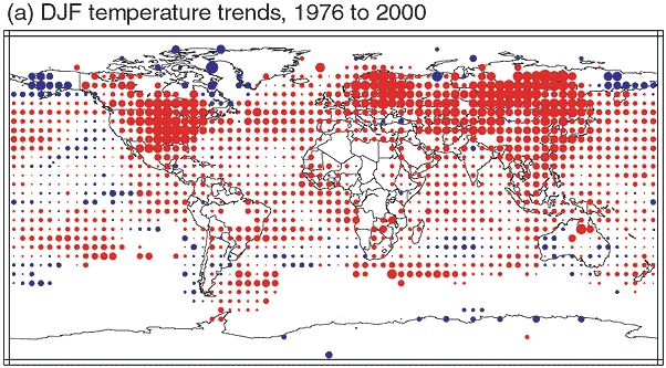
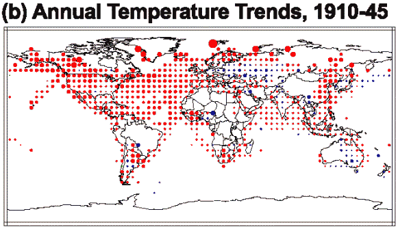
result of the greenhouse effect The use of annual temperature anomaly averages in 5° x 5° squares is illustrated in Figure 3.3 (8) which shows the temperature changes for the winter months of December, January and February between the years 1976 to 1999 for each square. The amounts are indicated by the size of the red dots (for a rise) and blue dots (for a fall). They show the grids where suitable measurements are currently available. The figure also shows that the rise in global temperature from 1976 to 1999, as indicated in Figure 3.1, was largely due to rises in temperature of weather stations in the USA, Northern Europe and the former Soviet Union, for the winter months. There was no temperature rise over this period for weather stations in the Arctic, or Antarctic, and only minimal rises for the Southern Hemisphere, or for the oceans.
Figure
3.3. Changes in the combined weather
station and ship temperatures for the winter months December, January and
February for the years 1976 to 1999 (8). Size of dots shows the amount of
change; red dots, a rise, blue dots, a fall The
reason for the rise in temperature shown by the global surface temperature
record (Fig. 3.1) over the years 1976 to 1999 was therefore mainly due
to improved winter heating conditions around land-based weather stations
in the Northern Hemisphere. The
assumption that a temperature record from a city or an airport can be
considered to represent temperature behaviour of
a surrounding forest, farmland, mountain area, or desert is absurd.
Table 3.1 (9) shows that most of the energy given off by combustion of
fossil fuels is given off in the neighbourhood of urban areas The
mean energy emitted by combustion of fossil fuels over the whole world is
0.02 Watts per square metre. However, this energy is emitted in a highly
irregular manner. Over the USA the mean figure is 0.31 W/sq..m, and over
California 0.81 W/sq. m. If energy emission is assumed proportional to
population density, then the figure for San Francisco is 89.24 W/sq m. For
Germany the average is 1.23 W/sq m., and for the industrial area of Essen,
221.65 W/sq. m. For New Zealand the average is 0.8W/ sq m., and for the
city of Auckland, 28.2W/ sq m. These
figures should be compared with the claimed `global warming’ made by
the IPCC (10) by the build-up of greenhouse gases in the atmosphere since
the year 1750: the amount of 2.45W/sq
m. It is clear that the
predominant location of weather stations close to cities and airports can
lead to “global warming” from local
energy emissions which
can considerably exceed the claimed effects of greenhouse gases Figure
3.1 violates a basic principle of mathematical statistics which asserts
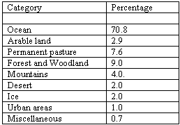
that a fair average of any quantity cannot be made without a representative sample. Table 2 (11) shows
the approximate
distribution of climate zones on the earth’s surface. Weather stations
are situated almost entirely in the “urban area” category,
only 1% of the earth’s surface, where energy emission is many
times the amount claimed to be caused by the greenhouse effect.
The
comparison between temperature measurements made in regions remote from
human habitation and those by weather stations has been displayed
dramatically by Mann and Bradley (12,
13), and promoted by the IPCC (14)
as shown in Figure 3.4 Figure
3.4 has several interesting features. The blue curve represents an
amalgamation of “proxy” temperature measurements which mainly involve
deductions from the width of tree rings which
are highly inaccurate since tree rings only show growth in the
summer, so indicate only summer temperatures. The representativity of the
samples is even worse than with the weather station data, but
at least the measurements are all far from human activity. Mann, and the IPCC, claim that Figure 3.4 proves that the weather station measurements are influenced by “anthropogenic” factors, and, of course, this is probably true. But they fail to see that the “anthropogenic” effect is caused by local energy emissions, not by changes in the atmosphere.
Figure 3.4. Comparison of Northern Hemisphere temperature record from proxy measurements (in blue) with weather station measurements (in red): from Mann and Bradley (12,13 ) and (14). Note the additional temperature rise from proximity of weather stations to urban areas. The gray region represents an estimated 95% confidence interval. The blue curve, for proxy measurements, shows a recent increase, though within the error estimates from past measurements. Some of this increase can be attributed to enhanced tree growth from the increased carbon dioxide.
Figure
3.5 “Proxy”
temperatures deduced from tree rings in Northern Siberia
(15) Recent proxy
results do not always confirm a warming trend. As an example, see Figure
3.5. which gives some tree ring measurements from a Northern Siberia (15). Figure 3.5, in
contrast to Figure 3.4, shows
the `Medieval Warm Period' (900 to 1100), the `Little Ice Age’
in the early 1800s, and the peak in the 1940s, also evident in Figure 3.1,
but shows that, apart
from these sporadic effects, there was no overall “global warming” for
the past 2000 years. Many
weather station measurements from remote areas, apparently uninfluenced by
changes in the surroundings, also
show no evidence of “global warming” (16,
17). The
three authorities responsible for the combined surface record - The
University of East Anglia, The Goddard Institute for Space Studies, and
The Global Historical Climate Network, (GHCN) have
recognised that records close to towns are subject to “urbanisation”
effects, and they have claimed to have
applied “corrections” to
the data, such as those displayed in Figure 3.1. The
procedure is to compare a record from an urban area with one in the same
district which is rural, and correct the urban record according to the
difference between them. This
method is incomplete. To begin with, it can only be done where suitable
records for comparison are available over a reasonable length of time.
This means the corrections cannot be made where records are sparse,
which applies to most of the globe, and they cannot be applied for recent
records which have not been going long enough. Lists of records that have
been “corrected”, are only available from Hansen
(18), and the `corrections' seem to be very small. The `corrections' claimed by
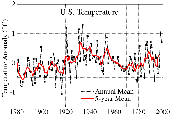
the University of East Anglia do not seem to exist (19) The most serious defect of the method is that it assumes that there is no `urbanisation' effect for the “rural” record that is taken as a standard. Many studies (20) have shown that there is an `urbanisation' effect even at stations that are far from cities, or near cities with a small local population. Surrounding buildings, roads, concrete, vehicles, aircraft, and increasing shelter can all provide an upwards bias even to `rural' records It should not really be possible to correct an unrepresentative sample, but the best prospects would be with records that are extensive in coverage and in time, under the same national administration, and of known high quality. The only records that can qualify are those for the continental United States. It is therefore significant that the corrected mean surface record for the United States (Figure 3.6) shows no evidence of overall global warming since 1920, and the slight increase over the previous period is probably due to increased energy exposure of rural weather stations.
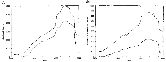
Figure 3.6 shows a temperature rise from 1910 to 1940 which fell again from 1940 to 1975. The most plausible explanation for this is the growth of towns in the first period, and the move of weather equipment to airports in the second. Another factor that has influenced the weather station record Figures (3.1, 3.6), is the variable number of stations available. Figure 3.7 (21) shows how station numbers and available grids have varied. The large increase after 1950 was an increase in rural stations, and of stations at airports, and it partly accounts for the fall in the combined temperature from 1950 to 1975 shown in Figure 3.1. The wholesale closure of mainly rural stations in 1989, combined with the increased energy release at airports partly accounts for the increase in the combined temperature record shown in Figure 3.1 since 1989.
Figure 3.7 Graphs
showing (a) Numbers of temperature
records available (upper
curve) and Maximum and Minimum records available (lower
curve). (b) Number
of 5° x 5° grids available with temperature records (upper curve) and
Maximum and Minimum temperature (Lower curve)
(21) Then,
there is the question of sea surface records. Figure 3.1 claims to
incorporate sea surface records. As the ocean is 70.8 percent of the
earth’s surface, inclusion of sea surface temperature records is rather
vital for representativity. Sea Surface temperature records are voluminous (80 million observations) and extensive, but they suffer from serious defects. Weather station records, plus the limited numbers of fixed buoys, have temperatures taken in the same place over a period of time by qualified staff and continuity of administration. Ship measurements are rarely in the same place, the procedures are far from standard, and the staff and control are often less than professional. Most early measurements were by recovery of samples by buckets, and more recent measurement at the engine intake. There are also measurements of night marine air temperature, from deck measurements, usually from a Stevenson screen. Folland
and Parker (22) suggested corrections to sea surface temperature
measurements which have led to their amalgamation with the land-based
measurements by British workers to give the combined record of Figure 3.1.
One persistent problem is incomplete information; for example, what sort
of bucket was used to collect a sample. When in doubt, Folland and Parker
allow the sea surface temperature to coincide with the land-based
temperature, which means that
there was little obvious change from the addition of the sea surface data. Doubts
that the use of sea surface data is justified have recently been shown by
Parker himself, in association with Christy and others (23) who found that there is a discrepancy between the current
measurement of sea surface temperature by engine intakes, and the
measurements closer to the surface made by fixed buoys and on ship’s
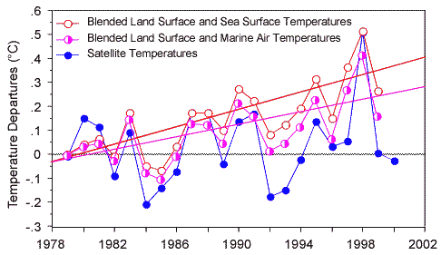
decks. Figure 3.8 (24) shows a comparison between the accepted surface/sea surface combined measurements, those modified by the correction of Christy et al (23) to incorporate only marine air temperatures, and the globally averaged satellite measurements. It shows the large discrepancy between sea surface and engine intake measurements, and the corresponding lack of overall increase shown by the satellite measurements (see below).
Figure 3.8 Comparison
between blended land surface and sea surface temperatures, blended land
surface and marine air temperatures and satellite temperatures, from 1978
(24) The United States compilers of global temperature (21, 25) refuse to recognise the sea surface data from ships as reliable, so that their compilations deal only with land-based records, plus recent sea surface data from satellites Recent
satellite measurements of mean sea surface temperature (26) have found no
evidence of distinguishable warming for the past 16 years, after allowance is made for the effects of volcanic
eruptions and El Niño events. The mere presence of a ship in the ocean is bound to influence the temperature of the surrounding sea surface temperature, so that ship measurements are subject to the same influences of greater size and energy consumption in ships as are the land measurements. As for the night marine air temperature, where do they place the Stevenson screen? Usually up against the funnel.
Since
the temperature rise shown in Figure 3.1 between 1910 and 1945 could not
have been due to greenhouse gas increase, the question is, what was the
cause? Figure 3.10. shows
changes in individual 5° x 5° grids over this period (28). As
before, the size of the dots in individual grids gives the size of the
change, red for a rise and blue for a fall. Most of the temperature rise
between 1910 and 1940 (shown by larger red dots) were in the United States
and in the Atlantic ocean.
The US rise is probably a
result of the increased size of American cities when Europe was affected
by war. The ocean measurements would have been affected
by the absence of lights on ships during the two wars, which meant that
measurements had to be made below deck, plus great increases in the size
and energy consumption of ships. It is interesting that some of the greatest increases over the period took place in the Arctic, whereas the Arctic stations showed a fall in temperature over the period 1901 to 2000 (7). The unrepresentative character of the coverage is evident from Figure 3.10, so the apparent trend cannot be taken too seriously.
Figure 3.10 Temperature change for individual 5° x5° grids from 1910 to 1945. The area of the dot shows size of increase, per decade (red dots) or decrease per decade (blue dots) (28) .
To summarise this section: The combined
surface record (Figure 3.1 and its companions) is not a reliable indicator
of global temperature change. It
is based on a heavily biased sample, so that it actually represents a
modified version of the temperature conditions surrounding weather
stations, as influenced by larger than the average energy emissions,
towns, buildings, roads, vehicles and aircraft. The increase of merely
0.6°C over 140 years could easily represent changes in surrounding energy
conditions. The large
differences often shown between neighbouring grids on the temperature maps
(7) indicate that they are locally influenced The
fact that many more remote stations and
most `proxy’ measurements show no overall warming,
indicate the absence of a steady warming trend over the past century. Measurements of
temperature in the lower atmosphere confirm this conclusion. Since 1958
there have been temperature measurements by weather balloons (radiosondes)
from 63 sites which were scattered over the globe, but were mainly over
land, in the more highly populated parts of the world. (29) The mean global temperature for the lower atmosphere is shown in Figure 3.11 (29)
Figure 3.11
shows that the temperature of the lower atmosphere was approximately
constant since 1976, in contrast to the combined surface measurements
(Figure 3.1). The annual fluctuations shown by Figure 3.11, are very
similar in Figure 3.1, suggesting that both methods faithfully record
temperature changes due to volcanoes, solar fluctuations and ocean
variability. The
sudden jump which took place between 1955-1975 and 1976-1999 is difficult
to explain. It could be a consequence of the limited coverage, or changes
in instrumentation, or it could be a genuine climate adjustment. There is,
however, no justification in putting a linear regression line through the
whole series, as there is no evidence of a regular linear change. After
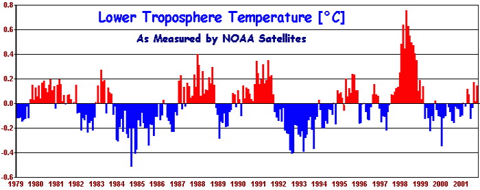
all, the figure for 1958 was the same as that for 1999 Since
1979, NOAA satellites have been measuring the temperature of the lower
atmosphere using Microwave Sounder Units (MSUs).
The method is to measure
the microwave spectrum of atmospheric oxygen, a quantity dependent on
temperature. It is much more accurate than all the other measures and,
also in contrast to other measurements,
it gives a genuine average of temperature over the entire earth’s surface. Various efforts to detect errors
have not altered the figures to any important degree. The record is shown
in Figure 3.12 (30) The
annual fluctuations in this record agree well with those in the combined
surface record (Figure 3.1) and with the radiosonde record
(Figure 3.11).
However, when these fluctuations are removed from this record (31) there
is no overall evidence of a warming trend. The very large effect of the El
Niño event in 1998 gives a spurious impression of a small upwards trend. The absence of a distinguishable change in temperature in the lower atmosphere over a period of 21 years, is a fatal blow to the `greenhouse' theory, which postulates that any global temperature change would be primarily evident in the lower atmosphere. If there is no perceptible temperature change in the lower atmosphere then the greenhouse effect cannot be held responsible for any climate change on the earth’s surface. Changes in precipitation, hurricanes, ocean circulation and lower temperature, alterations in the ice shelf, retreat of glaciers, decline of corals, simply cannot be attributed to the greenhouse effect if there is no greenhouse effect to be registered in the place it is supposed to take place, the lower atmosphere.
Figure 3.12
Mean global temperature anomalies of the lower atmosphere, By
contrast, the combined surface record (Figure 3.1) is nothing more than a
record of an averaged presentation of the temperature conditions near
weather stations and ships; influenced by the additional energy emissions
associated with urban environments, and
not a valid record of mean global temperature because it uses a
highly biased sample (32) We therefore have a situation where all direct measurements of mean global temperature show no evidence of a change, at least over the past 21 years, and probably over the past century. There is therefore no reason for any precautionary measures intended to prevent or limit such a temperature change. References (1) Climatic Research Unit, University of East Anglia, UK, http://www.cru.uea.ac.uk (2) Climate Change 01 Chapter 2, Figures 2.1, 2.4, 2.5, 2.6, 2.7, 2.8, 2.12, 2.19, 2.21. (3) Anita McConnell 1992 “Assessing the value of historical temperature measurements” Endeavour 16 (2) 80-84 (4) Gray, V R, 2000. “The Surface Temperature Record” http://www.john-daly.com/graytemp/surftemp.htm (5) Daly, J L, 2000 “The Surface Record : Global Mean Temperature and how it is determined at the surface level”. http://www.greeningearthsociety.org/Articles/2000/surface1.htm (6) Hansen, J and S Lebedeff 1987 “Global Trends of Measured Surface Air Temperature” Journal of Geophysical Research 92 13345-13372 (7) Climate Change 01 Chapter 2, “Observed Climate Variability and Change” , Figures 2.9 and 2.10, pages 116-7 (8) Climate Change 01 Chapter 2 “Observed Climate Variability and Change” Figure 2.10a, page 117 (9) Carbon
Dioxide Information and Analysis Center, Oakridge, Tennessee,
http:/cdiac.esd.ornl.gov/trends, United
Nations Energy Handbook and estimates (10) .Climate Change 01 Chapter 6. “Radiative Forcing of Climate Change” Figure 6.6, page 392 (11) Adapted from the CIA Factbook, http://www.oda/gov/cia/publications/factbook (12) Mann, M E, R S Bradley & M K Hughes 1998 “Global-scale temperature patterns and climate forcing over the past centuries" Nature 392 778-787 (13) Mann, M E , R S Bradley & M K Hughes 1999 “Northern Hemisphere Temperatures During the Past Millennium: Inferences, Uncertainties and Limitations” Geophysical Research Letters 26 759-76 (14) Climate Change 01 Summary for Policymakers, Fig 1. Page 3 (15) Naurzbaev, K M, & E A Vaganov 2000 “Variation of early summer and annual temperature in east Taymir and Putoran (Siberia) over the last two millennia inferred from tree rings“ Journal of Geophysical Research 105 7317-7326 (16) Daly, J L , 2001. “What the stations say”. http://www.john-daly.com/stations/stations.htm (17) CO2 Science Magazine. 2001 http://www.co2science.org (18) Hansen J et al 2001 http://www.giss.nasa.gov/data/update/gistemp (19) Hughes, W S . 2001 http://www.webace.com.au/~wsh (20) Gray,
V R . 2000 “The Surface Temperature Record”
http://www.john-daly.com/graytemp/surftemp.htm (21) Peterson, T C , and R S Vose 1997 “An Overview of the Global Historical Climatology Network Temperature Database” Bulletin of the American Meteorological Society 78 2837-2849 (22) Folland C K and D E Parker 1995 ”Correction of instrumental biases in historical sea surface temperature data“ Quarterly Journal Meteorological Society 121 319-367 (23) Christy, J R , D E Parker, S J Brown, I Macadam, M Stendel & W B Norris 2001 “Differential Trends in Tropical Sea Surface and Atmospheric Temperatures since 1979” Geophysical Research Letters 28 183-186 (24) World Climate Report 2001 6 (9) “Satellite `Warming' vanishes”. (25) Goddard Institute of Space Studies (GISS) at http://www.giss.nasa.gov and GHCN at http://www.ncdc.noaa.gov (26) Strong, A E , E J Kearns K K Gjovig 2000 “Sea Surface Temperature Signals from Satellites - An Update“ Geophysical Research letters 27 1667-1670 (27) Levitus, S, J Antonov, T P Boyer, and C Stephens 2000 Science 287 2225-2229 (28) Climate Change 01 Chapter 2 Figure 2.9b page 116 (29) Carbon Dioxide Information and Analysis Center, Data plotted from http://cdiac.esd.ornl.gov/trends (30) “Still Waiting for Greenhouse” http://www.john-daly.com (31) Michaels, P J and Knappenberger 2000, “Natural Signals in the MSU lower tropospheric temperature records” Geophysical Research Letters 27 2905-2908 (32) Gray, V R , 2000 “The Cause of Global Warming.” Energy & Environment 11 613-629
Go to Chapter 4 (to be published in a few days) |
Return to `Climate Change Guest Papers' page
Return to `Still Waiting for Greenhouse' main page