Sun's
Role
in the
Satellite-Balloon-Surface Issue
by
Dr Theodor Landscheidt
Schroeter Institute for Research in Cycles of Solar Activity
Nova Scotia, Canada
![]()
![]() There
has been an unending discussion about why temperatures measured by satellites
and balloon sondes, progressing almost in lockstep on a trend line close
to the horizontal, diverge from surface temperatures that show, at least
in the last decade, a steep warming trend. The figure below shows the course
of the anomalies in the three data sets which are referenced to a common
zero point in 1979 - the beginning of the satellite measurements - to show
the subsequent comparative trends. This presentation follows the design
of the "World
Climate Report" chart. New is the relationship with the Sun's
eruptional activity which forms a pattern fully conforming with the balloon
and satellite data, but only to a certain degree with the surface temperatures.
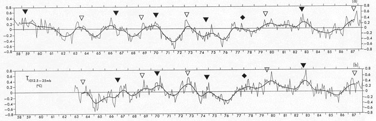
There
has been an unending discussion about why temperatures measured by satellites
and balloon sondes, progressing almost in lockstep on a trend line close
to the horizontal, diverge from surface temperatures that show, at least
in the last decade, a steep warming trend. The figure below shows the course
of the anomalies in the three data sets which are referenced to a common
zero point in 1979 - the beginning of the satellite measurements - to show
the subsequent comparative trends. This presentation follows the design
of the "World
Climate Report" chart. New is the relationship with the Sun's
eruptional activity which forms a pattern fully conforming with the balloon
and satellite data, but only to a certain degree with the surface temperatures.

![]() The
filled triangles in the figure mark the initial phases of a solar motion
cycle with a mean length of 8.6 years described in my paper "Solar
Activity: A Dominant Factor in Climate Dynamics". The empty
triangles indicate golden section phases in between the initial phases
that have been shown to play an important role in many solar-terrestrial
cycles. Solar eruptions concentrate on both of these phases which correlate
well with all peaks in the figure. Balloon data going back to 1958 confirm
this relationship, as is shown in Figure 24 of
the quoted paper. In spite of my explicit challenges, no IPCC scientist
ever tried to show that these results are spurious.
The
filled triangles in the figure mark the initial phases of a solar motion
cycle with a mean length of 8.6 years described in my paper "Solar
Activity: A Dominant Factor in Climate Dynamics". The empty
triangles indicate golden section phases in between the initial phases
that have been shown to play an important role in many solar-terrestrial
cycles. Solar eruptions concentrate on both of these phases which correlate
well with all peaks in the figure. Balloon data going back to 1958 confirm
this relationship, as is shown in Figure 24 of
the quoted paper. In spite of my explicit challenges, no IPCC scientist
ever tried to show that these results are spurious.
![]() Empty
circles mark midpoints between the respective phases which are correlated
with troughs in the data. The connection has been corroborated by correct
long-range forecasts of the temperature trough in winter 1996/1997 and
the crest in 1998. The next minimum in the temperature anomalies is to
be expected after 2000.6 and the next maximum after 2002.9 as indicated
in the figure. This forecast could be extended as the phases of the solar
motion cycle can be computed. The temperature data consistently lag the
solar phases by a few months, thus pointing to a causal relationship.
Empty
circles mark midpoints between the respective phases which are correlated
with troughs in the data. The connection has been corroborated by correct
long-range forecasts of the temperature trough in winter 1996/1997 and
the crest in 1998. The next minimum in the temperature anomalies is to
be expected after 2000.6 and the next maximum after 2002.9 as indicated
in the figure. This forecast could be extended as the phases of the solar
motion cycle can be computed. The temperature data consistently lag the
solar phases by a few months, thus pointing to a causal relationship.
![]() Intriguingly,
the three initial phases (filled triangles)
indicate periods of close encounters of the three data curves. This was
even so in 1998 after a strong divergence in the preceding years. The next
encounter should occur a few months after 2005.8. The surface temperature
diverges strongest from the two other curves around the midpoints between
active phases of the solar motion cycle. Balloon and satellite data give
in to the solar forcing quite naturally, whereas the surface data seem
to be kept away from fully adjusting to the natural downward trend. Currently,
such a development is in the making and is expected to show its full extension
after 2000.6. The next such event should occur around 2004.4. The overall
impression is that the satellite and balloon data behave naturally, whereas
the surface data do not respond to the solar forcing in the same way. Lots
of explanations have been given on this web site why this should be so.
Intriguingly,
the three initial phases (filled triangles)
indicate periods of close encounters of the three data curves. This was
even so in 1998 after a strong divergence in the preceding years. The next
encounter should occur a few months after 2005.8. The surface temperature
diverges strongest from the two other curves around the midpoints between
active phases of the solar motion cycle. Balloon and satellite data give
in to the solar forcing quite naturally, whereas the surface data seem
to be kept away from fully adjusting to the natural downward trend. Currently,
such a development is in the making and is expected to show its full extension
after 2000.6. The next such event should occur around 2004.4. The overall
impression is that the satellite and balloon data behave naturally, whereas
the surface data do not respond to the solar forcing in the same way. Lots
of explanations have been given on this web site why this should be so.