THE CAUSE OF GLOBAL WARMING
by
VINCENT GRAY
Climate Consultant, 75 Silverstream Road, Crofton Downs, Wellington 6004, New Zealand
Email - vinmary.gray@paradise.net.nz
Lecture to the Wellington Branch of the Royal Society of New Zealand, 22nd November 2000
![]()
ABSTRACT
Three of the four methods of measuring global temperature show no signs of global warming
Proxy measurements (tree rings, sediments etc) for the past 1000 years
Weather balloons (radiosondes) for the past 44 years
Satellites (MSU Units) for the past 21 years.
The fourth method, surface measurement at weather stations, gives an averaged mean global rise of a mere 0.6°C over 140 years, but is intermittent and irregular. Individual records are highly variable, regional, and sometimes, particularly in remote areas, show no change, or even a fall in temperature.
It is concluded that temperature measurements carried out away from human influence show no evidence of global warming.
The small and irregular rise shown by many surface stations must therefore be caused by changes in their thermal environment over long periods of time, such as better heating, larger buildings, darkening of surfaces, sealing of roads, increases in vehicles and aircraft, increased shielding from the atmosphere and deterioration of painted surfaces.
1. THE MEASUREMENT OF GLOBAL TEMPERATURE
On June 23rd 1988 Dr James Hansen of the Goddard Institute of Space Studies, New York told the US Senate that he had devised a method for calculating the average temperature of the earth’s surface by amalgamating the many thousands of temperature measurements collected by weather stations (Hansen and Lebedeff 1987). His method can be illustrated by Figure 1, (from Karl 1998) which shows global temperature changes from 1901 to 1996. Red dots show a temperature rise and blue dots a temperature fall, with the area of the dot indicating the size of the rise or fall (in °C/100 yr)

Figure 1. Global temperature changes 1901-1996 for individual 5°x5° grids (Karl 1998)
The method involves dividing the world into 5°x5° latitude/longitude boxes on a Mercator map. In each box, the average temperature for each month of each year is calculated from records of all the weather stations that are regarded as reliable. This figure is then subtracted from the average monthly temperature for the same box for a reference period (currently 1961-1990). The result is the Temperature Anomaly for that box for that year. The average of all these can then be made for the whole year for each box, and then for the globe, or for the Northern or Southern Hemispheres. A current version of annual anomalies for the Northern and Southern Hemispheres, and for the globe since 1860 is given in Figure 2 (IPCC1996 plus updates). Until a record based on the amalgamation of surface readings was published in 1987 the idea of “global warming” did not, and could not exist. This record remains to this day the only evidence for “global warming”.
 Figure
2. Combined annual land-surface air and sea surface temperature
anomalies (°C) for (a) Northern Hemisphere, (b) Southern Hemisphere,
( c) for Globe (University
of East Anglia:, IPCC 1996, updated)
The overall global rise is considered to be 0.6°C ±0.2°C over 140 years. It is difficult to understand why this very small rise is regarded as important. All of us endure fluctuations of more than this amount as a routine. It is an amount that is hardly noticeable, and would make very little difference to any biological system over such a long period. Much greater variability occurs over short distances or times.
Yet it has taken on tremendous significance. The nations of the world have regarded it as indicative of a potential future disaster and are busy taking economically damaging measures which they believe may avert it.
The record passes through several phases of different behaviour.
From 1860 to 1910 there was a slight fall of about 0.15°C
From 1910 to 1940 there was a rise of about 0.5°C
From 1940 to 1975 there was a fall of about 0.15°C
From 1975 to 2000 there was a rise of about 0.5°C
There is an obvious explanation for these sequences, related to the increase in human population, the growth in the number and size of buildings, and the increased use of energy over the period.
From 1860 to 1910 the system was becoming established in the large industrial cities and spreading over the globe. Equipment was being moved from the sides and roofs of buildings to protected enclosures, leading to a slight fall in the average.
From 1910 to 1940 the cities expanded, together with their energy use. Thermometers still suffered from an upwards bias because of the shrinkage of the thermometer glass. The first world war closed many stations which were rebuilt with better facilities, still mainly in large cities.
From 1940 to 1975 many stations were moved to airports and others were set up in rural areas, so causing an average fall in temperature.
From 1975 to 2000 airports expanded to become “heat islands” and better heating took place everywhere.
This explanation is confirmed if there is no global warming for temperature measurements taken remote from human habitation.
There are only minor differences between the two Hemispheres. Since 1975 the Northern Hemisphere has warmed more then the Southern Hemisphere.
The fluctuating behaviour of the record is incompatible with any explanation involving a steady climate change and it is not possible to establish any particular trend. The use of linear regression to characterise the overall sequence, or any part of it, is no guide to its future course.
Monthly Individual land-surface station data are available from the US sources ( Goddard Institute of Space Studies, at http://www.giss.nasa.gov/data/update/gistemp/station_data/) and the Global Historical Climate Network, GHCN ( http://www.ncdc.noaa.gov). Charts of annual means for the whole world can be downloaded from the GISS site, and for the USA from GHCN.
Monthly gridded anomaly figures are available also from these sources, as well as from the University of East Anglia Climate Research Unit (http://www.cru.uea.ac.uk).
Annual and hemispherical anomalies are available from all of these sources, but it is significant that the US have never recognised the reliability of the sea-surface temperatures that have been incorporated into the global and hemispherical annual anomalies by the British team (Folland and Parker 1995) which depends on “calibration” with surface sites. The IPCC (1990, 1996) have favoured the British series despite this doubt. There are also significant differences between the amalgamated annual records of the three authorities which raise doubt on the reliability of all of them.
The monthly recorded and gridded anomaly figures are too voluminous for easy individual study. It proved to be possible to obtain from NCDC/NOAA the annual gridded mean anomalies which formed the basis of Figure 1, plus the calculated temperature changes 1901-1996 which are plotted in Figure 1.The annual mean figures form the basis for the annual discrepancies of Figure 2.
Examination of this dataset reveals the following information.
Only 46% of the earth’s surface is covered by the boxes (938 out of 2592 boxes) in Figure 1 (60% of the Northern Hemisphere and 31% of the Southern hemisphere). This includes the sea surface temperature readings, which are regarded as unreliable by the US investigators. The land-based boxes (217) cover only 14% of the earth’s surface (11% in the Northern Hemisphere and 3.8% in the Southern Hemisphere).
There are gaps in most of the annual records for the boxes that are filled. The dataset consists only of records where there was a minimum of 72 out of the possible 96 readings. This means that there may be as many as 24 missing readings in some boxes. Many of these gaps were between 1914 and 1919. 51% of the 938 boxes have one or more missing readings over this period, and 23% are missing four or five annual readings. There must have been considerable disruption and discontinuity as a result.
The 1901-1996 temperature change was obtained by subtracting the average of the first five readings from the average of the last five readings. The maximum change was therefore from 1902 to 1995. Not all readings began in 1901. One box began as late as 1925.

Figure 3 (a) Number of stations measuring temperature (upper curve) and maximum and minimum temperature (lower curve); 3(b), numbers of grid boxes giving mean temperature (upper curve) and maximum and minimum temperatures (lower curve), in The Global Historical Climate Network (Peterson & Vose 1997)
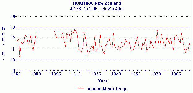
Besides the irregular behaviour of the mean temperature, it is evident from Figure 1 that there is pronounced regional irregularity. Several regions (Southeast United States, Bolivia, Alaska, Central Africa, Tibet, the Greenland Sea, Tananarive, Tombuktou) fell in temperature between 1901 and 1996. The greatest increase was over 4°C on Svalbard, close to a fall of 2°C in the neighbouring ocean (see Figure 18 below)
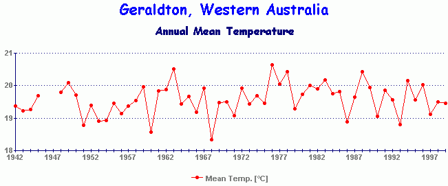
Although some reference boxes had many measurement stations, notably in Europe and the USA, other regions, notably Russia/USSR, depended on only one or two stations in each box. Over the 1900-1996 period there were huge gaps in coverage in the Pacific, Indian and Antarctic Oceans, Central Asia, Africa and South America, Arabia, Western Australia, Antarctica and the Arctic, so that the quoted averages may not be representative.
As is shown by Figure 3, the number of stations and boxes varied considerably over the years. In 1900 there were 1800, in 1970 there were 6000, and in 1996, 2,600 (Peterson and Vose 1997). Many stations were closed between 1980 and 2000, mainly in rural areas, so increasing the average temperature.
It is evident that the recorded temperature changes showed considerable regional variability which must surely be mainly associated with purely local changes related to proximity to human habitation.
This can be tested by comparing the combined surface measurements with the three other methods of measuring mean global temperature changes.
2. COMPARISON OF SURFACE TEMPERATURE WITH PROXY TEMPERATURE
Mann et al (1999) have recently compared the combined surface temperature record for the Northern Hemisphere with “proxy” temperature calculations for the past 1000 years. These have mainly been from the width of tree rings, but also from ice cores, marine sediments and coral growth (Figure 4.)

Figure 4. Millennial Northern Hemisphere temperature reconstruction (solid) and instrumental data (dotted) from AD 100-1998 (Mann et al 1999). Two standard errors are shown .
Since the proxy measurements were all from remote areas and most of the surface measurements were close to buildings, this comparison confirms the likelihood that the increase in the amalgamated surface readings is due to their proximity to human habitation. The statistical comparison is somewhat dubious however, since the proxy measurements do not appear to take proper account of the well established Medieval Warm Period and Little Ice Age which are featured in other studies.
The conclusion that the rise in the amalgamated surface measurements is caused by proximity to human habitation is confirmed if the proxy measurements are continued to the present day

Figure 5. Northern hemisphere tree-ring density chronologies, referred to 1881-1960 period. Extreme low values can be associated with volcanic events. (from Briffa et al 1998)
Figure 5 which shows Northern Hemisphere tree ring density since 1400 shows no evidence of warming for the Northern hemisphere since then, and indicates a recent fall rather than a rise.
Figure 6 goes back much further, more than 2000 years, and shows a slight recent warming which cannot be considered as exceptional. A slight increase in tree-ring thickness recently is to be expected because of the increased atmospheric concentration of carbon dioxide

Figure 6. Reconstructed early summer temperature history in Northern Siberia (top) and a 57 year smoothed version of the same data (bottom) (Naurzbaev and Vaganov 2000)
To conclude: the proxy temperature measurements confirm that there has been no global warming in locations far from human habitation.
To further explore the contrast between sites close and remote from human activity, let us examine other records of global temperature change.
3. GLOBAL TEMPERATURE FROM WEATHER BALLOONS
Weather balloons (radiosondes) have been measuring temperature in the lower atmosphere since 1956. There are three sets of records which agree fairly well.
Figure 7 shows the temperature record of weather balloons (HadRT2.0 T2LT) of Parker et al (1997, updated). It is plotted together with the satellite (MSU) measurements which closely agree and are discussed below.
It will be seen that the readings fell below zero between 1960 and 1980, but rose again to the level of 1956 until the present day. These results have been interpreted as showing a temperature rise, but the fluctuations are likely to be due to natural variability. The overall change over the 1956-2000 period is surely zero.
Similar remarks apply to the results of Angell (1999). He tries to argue that the top series in Figure 8 show a rise similar to that of the surface measurements; but in fact they actually show no rise at all since 1956, but fluctuations down and then up.

Figure 7. Weather balloon (radiosonde) temperature anomalies in lower atmosphere from 1956, with satellite (MSU) readings , from 1979. (Parker et al 1997)

Figure 8. Weather balloon (radiosonde) temperature measurements (top) compared with surface measurements (bottom); from Angell (1999)
4. GLOBAL TEMPERATURE FROM SATELLITES
The most reliable global temperature measurements, since 1979, are those made by NASA satellites, using Microwave Sounder Units (MSUs). The temperature of various levels in the atmosphere is measured from the microwave absorption of oxygen, which is sensitive to temperature change. Measurements have a greater accuracy than the surface measurements (Christy and Goodridge 1977). They not only provide the only genuine global average, but they are able to supply a temperature record for any designated region on the earth’s surface.
The latest MSU satellite record for the lower atmosphere is shown n Figure 9. It will be seen that it shows no overall warming since 1979. The exceptionally high figure for 1998, which was also evident in the weather balloon and surface records, was thought by some to indicate an overall rise in the satellite record. It has, however been evident from subsequent measurements that it represented an exceptionally high, but temporary departure from a zero trend, attributed to the El Niño event of 1998. The subsequent measurements indicate the complete absence of any positive trend.
Figure 12 gives a comparison between the weather balloon, satellite, and two different surface measurements, for the period from 1979 to 2000


